How to create different themes in Material-UI React
Material-UI themes:
In Material-UI, we can define the theme at one place. We can define all fonts, color palette at one place in our application. By default, it provides a default theme. You can check this object here.
In this post, we will learn how to configure theme in Material-UI.
YouTube video:
I have published one video on YouTube. You can watch it here:
Base project:
We will create one simple project and add theme to it.
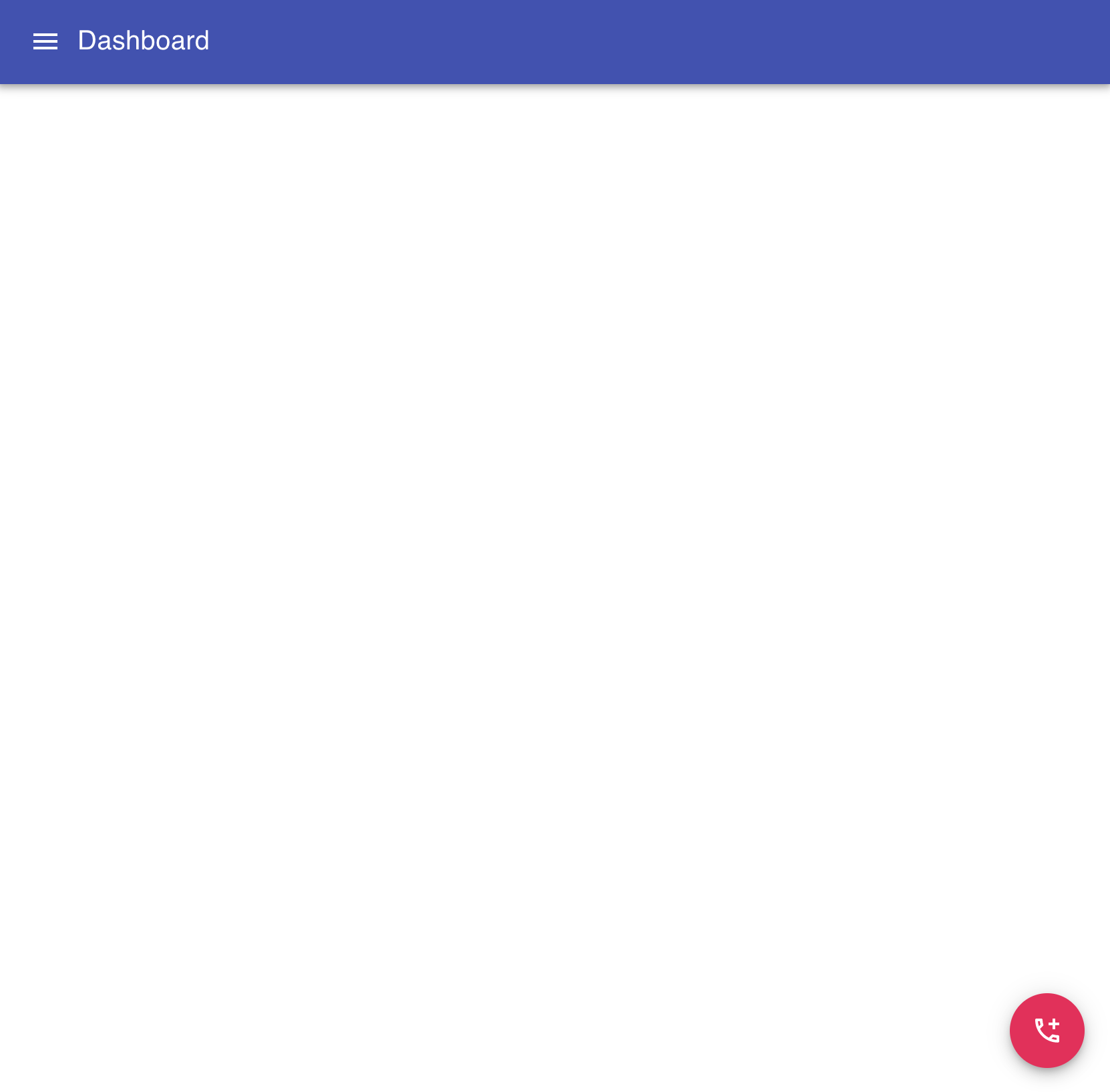
Create one file Main.js as like below:
import {
  makeStyles,
  createStyles,
  AppBar,
  Toolbar,
  IconButton,
  Typography,
  Fab,
} from "@material-ui/core";
import { AddIcCallOutlined } from "@material-ui/icons";

import MenuIcon from "@material-ui/icons/Menu";
const useStyles = makeStyles((theme: Theme) =>
  createStyles({
    root: {
      margin: theme.spacing(2),
      width: theme.spacing(50),
    },
    fab: {
      position: "absolute",
      bottom: 20,
      right: 20,
    },
  })
);

function Main() {
  const classes = useStyles();

  return (
    <>
      <AppBar position="static">
        <Toolbar>
          <IconButton style={{ color: "white" }} edge="start">
            <MenuIcon />
          </IconButton>
          <Typography variant="h6">Dashboard</Typography>
        </Toolbar>
      </AppBar>
      <Fab color="secondary" className={classes.fab}>
        <AddIcCallOutlined />
      </Fab>
    </>
  );
}

export default Main;
Use it in your App.js:
import Main from "./Main";

function App() {
  return (
    <div>
      <Main />
    </div>
  );
}

export default App;
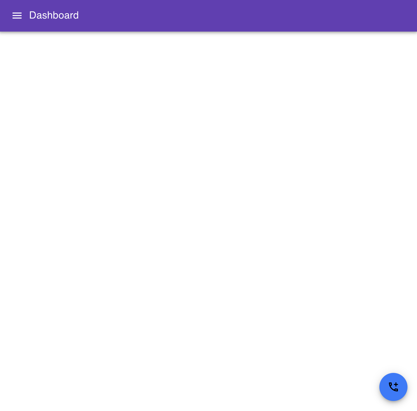
Changing the theme:
You can change the theme and add it to the root component as like below:
import Main from "./Main";
import { createTheme, ThemeProvider } from "@material-ui/core/styles";

function App() {
  const theme = createTheme({
    palette: {
      primary: {
        light: "#b39ddb",
        main: "#673ab7",
        dark: "#512da8",
        contrastText: "#fff",
      },
      secondary: {
        light: "#448aff",
        main: "#2979ff",
        dark: "#2962ff",
        contrastText: "#000",
      },
    },
  });

  return (
    <ThemeProvider theme={theme}>
      <Main />
    </ThemeProvider>
  );
}

export default App;
It will change it to:
You can check the default theme object to customize different theme properties.