How to create Material Tabs in Material-UI react
Introduction to Material-UI tabs:
In this post, we will learn how to create tabs in Material-UI. Material-UI provides one component called Tabs that can be used to create a tab in Material-UI. In this post, we will learn how to create material designed tabs using Material-UI with examples.
YouTube video:
We have published one video on YouTube. You can watch it here:
Import Tabs component:
Tabs is the component used to show tabs and Tab is the component used for each tab. We can import these components as like below:
import { Tabs, Tab } from "@material-ui/core";
Simple example of Tabs:
Let's try it with an example:
import { AppBar, Tab, Tabs } from "@material-ui/core";

function App() {
  return (
    <div>
      <AppBar>
        <Tabs value={0}>
          <Tab label="First Tab" />
          <Tab label="Second Tab" />
          <Tab label="Third Tab" />
        </Tabs>
      </AppBar>
    </div>
  );
}

export default App;
This will create one tab bar inside an AppBar. The value defines the currently selected tab.

If you click on the tabs, it will not change it. For that, we need to maintain one state with the current selected index.
import { AppBar, Tab, Tabs } from "@material-ui/core";
import { useState } from "react";

function App() {
  const [index, setIndex] = useState(0);
  const onTabClicked = (event, index) => {
    setIndex(index);
  };
  return (
    <div>
      <AppBar>
        <Tabs value={index} onChange={onTabClicked}>
          <Tab label="First Tab" />
          <Tab label="Second Tab" />
          <Tab label="Third Tab" />
        </Tabs>
      </AppBar>
    </div>
  );
}

export default App;
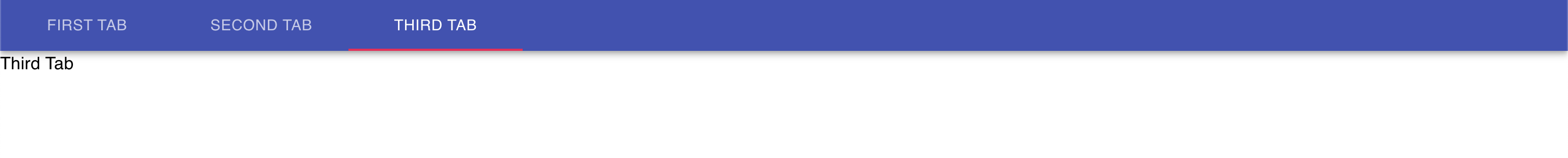
Showing different components based on tab click:
If we click on any tab, it will call onTabClicked and it will change the current selected tab index.
import { AppBar, Tab, Tabs, Typography, Box } from "@material-ui/core";
import { useState } from "react";

const Panel = (props) => (
  <div hidden={props.value !== props.index}>
    <Typography>{props.children}</Typography>
  </div>
);

function App() {
  const [index, setIndex] = useState(0);
  const onTabClicked = (event, index) => {
    setIndex(index);
  };
  return (
    <Box>
      <AppBar position="static">
        <Tabs value={index} onChange={onTabClicked}>
          <Tab label="First Tab" />
          <Tab label="Second Tab" />
          <Tab label="Third Tab" />
        </Tabs>
      </AppBar>
      <Panel value={index} index={0}>
        First Tab
      </Panel>
      <Panel value={index} index={1}>
        Second Tab
      </Panel>
      <Panel value={index} index={2}>
        Third Tab
      </Panel>
    </Box>
  );
}

export default App;
In this example, we are changing the value of index on each tab click. Based on its value, it is loading a different Panel component.
full width tabs:
We can set the variant of Tabs as fullWidth to make it a full width tab.
<Tabs variant="fullWidth" value={index} onChange={onTabClicked}>
...
...

Centered tabs:
centered props is used to make the tabs centered.
<Tabs centered value={index} onChange={onTabClicked}>
..
..

Scrollable tabs:
If you put too many Tab components inside a Tabs components, it will not make them scrollable. We need to assign the variant as variant="scrollable".
<Tabs
    variant="scrollable"
    centered
    value={index}
    onChange={onTabClicked}
>
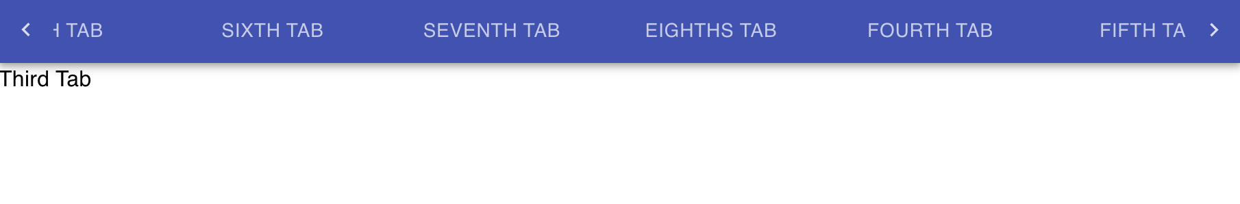
We can also remove the left and right buttons. We need to add scrollButtons="off" props for that.
<Tabs
    variant="scrollable"
    scrollButtons="off"
    centered
    value={index}
    onChange={onTabClicked}
>
It will make the tabs scrollable with the mouse.
Add icons to the tabs:
We can add icons to the Tab components. We need to use the icon props.
<Tabs centered value={index} onChange={onTabClicked}>
  <Tab label="First Tab" icon={<AccessAlarmOutlined />} />
  <Tab label="Second Tab" icon={<HomeOutlined />} />
  <Tab label="Third Tab" icon={<MessageOutlined />} />
</Tabs>
We can also add only the icons without label.
Disable a Tab:
We can add disabled props to make one Tab disabled.
<Tab disabled label="Disabled Tab" icon={<MessageOutlined />} />
Vertical Tabs:
We can use orientation = 'vertical' to make the Tabs vertical:
<Tabs orientation='vertical' value={index} onChange={onTabClicked}>
...