How to create Paper in Material-UI react
Material-UI Paper component:
Paper component of Material-UI is used to create a flat and opaque layout. It is similar to the Card component, i.e. we can use it as a background for other components.
This post will show you how to use Paper and its different properties.
YouTube video:
I have published one video on YouTube. You can watch it here:
How to import Paper:
Paper is defined in material-ui/core. We can import it as like below:
import { Paper } from "@material-ui/core";
A simple example:
Let's take a look at the below example:
import { Box, Paper } from "@material-ui/core";
import { Theme, createStyles, makeStyles } from "@material-ui/core/styles";
const useStyles = makeStyles((theme: Theme) =>
createStyles({
root: {
display: "flex",
flexWrap: "wrap",
"& > *": {
margin: theme.spacing(10),
width: theme.spacing(15),
height: theme.spacing(15),
},
},
})
);
function App() {
const classes = useStyles();
return (
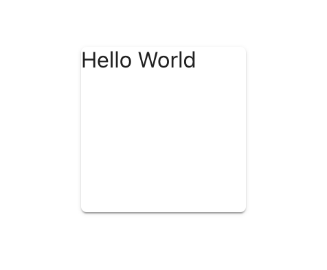
<Box className={classes.root}>
<Paper>Hello World</Paper>
</Box>
);
}
export default App;
It will create a Paper component with a text in it.
How to change the default component:
Paper uses div internally. But we can change it to any other component by using the component props.
<Paper component="p">Paper with 'p'</Paper>
Using this props, you can also change it to any component like h1, h2, etc.
Change the elevation:
Elevation can be changed by using the elevation props.
<Paper elevation={3}>elevation=3</Paper>
Outlined:
variant props is used to change the variant. We can change it to outlined:
<Paper variant="variant">variant='outlined'</Paper>
square:
We can change one Paper to square layout by using the square props:
<Paper square>square</Paper>
It will remove the corner radius.
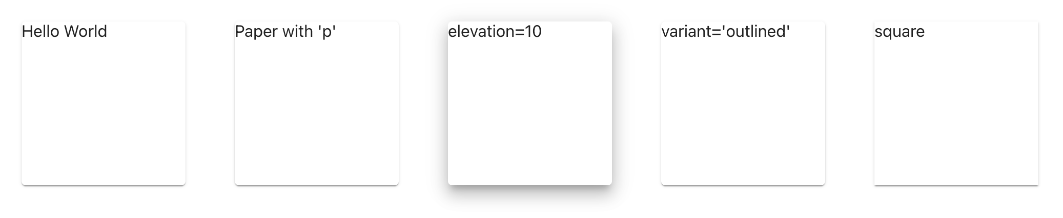
Complete example:
Below is the complete example with different usages we discussed above:
import { Box, Paper } from "@material-ui/core";
import { Theme, createStyles, makeStyles } from "@material-ui/core/styles";

const useStyles = makeStyles((theme: Theme) =>
  createStyles({
    root: {
      display: "flex",
      flexWrap: "wrap",
      "& > *": {
        margin: theme.spacing(3),
        width: theme.spacing(20),
        height: theme.spacing(20),
      },
    },
  })
);

function App() {
  const classes = useStyles();
  return (
    <Box className={classes.root}>
      <Paper>Hello World</Paper>
      <Paper component="p">Paper with 'p'</Paper>
      <Paper elevation={10}>elevation=10</Paper>
      <Paper variant="variant">variant='outlined'</Paper>
      <Paper square>square</Paper>
    </Box>
  );
}

export default App;