Button - Material-UI Reactjs
How to use button component in Material-UI React:
Button component of Material-UI is used to create buttons. It is a basic component used to create UI designs. Material-UI provides a couple of different material buttons those can be import and use in a reactjs project easily.
In this post, we will learn how to use Button component of Material-UI and its different variants.
Video:
You can watch the video here on YouTube:
How to import it:
Button is defined in @material-ui/core. Use the below line to import it:
import { Button } from "@material-ui/core";
Now, we can use it as like below:
import { Button } from "@material-ui/core";

function App() {
  return (
    <div>
      <Button>Primary</Button>
    </div>
  );
}

export default App;
Text, Contained and Outlined buttons:
Let's take a look at the below example:
import { Button } from "@material-ui/core";

function App() {
  return (
    <div>
      <Button>Primary</Button>
    </div>
  );
}

export default App;
If you run it, it will create one button as like below:
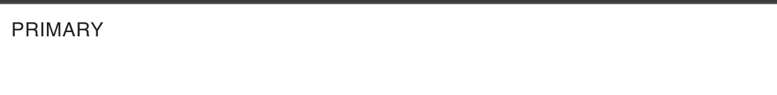
This is called a Text buttons. If you hover over it, it will show as clickable component.
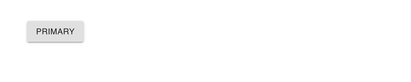
We have one more variant of buttons called contained. We need to use one props called Contained buttons.
import { Button } from "@material-ui/core";

function App() {
  return (
    <div style={{margin: 50}}>
      <Button variant='contained'>Primary</Button>
    </div>
  );
}

export default App;
It will change it to a Contained button.
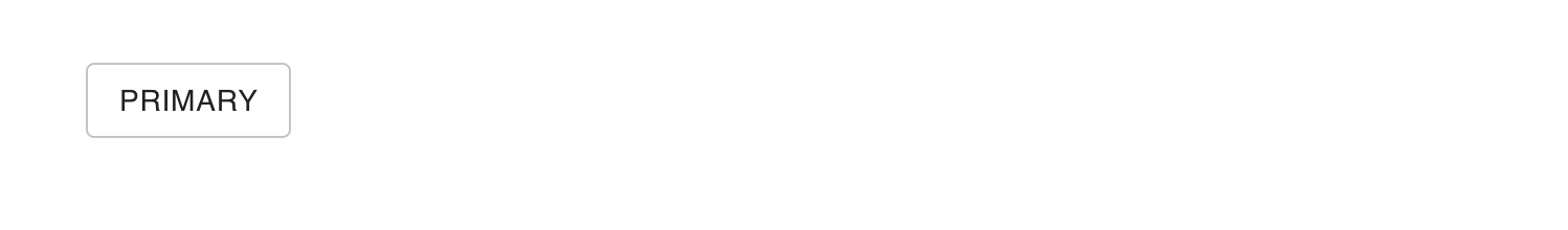
For outlined buttons, we need to change the variant to outlined.
<Button variant='outlined'>Primary</Button>
It will create:
Customize a button:
The below customization works with both text and contained buttons.
Change the color of a button:
We can change the color of a button by using the color props.
<Button variant='contained' color='primary'>Primary</Button>
This will add primary color to the button.
Disable a button:
We can use disabled property to disable a button. The below example makes the button disabled:
<Button variant='contained' color='primary' disabled>Primary</Button>
Adding link to a button:
We can use href property to add a link to a button.
<Button variant='contained' color='primary' href='https://google.com'>Primary</Button>
Listening click on a button:
By using onClick property, we can listen to the click on a button.
<Button variant='outlined' onClick={() => {alert('Clicked !!')}}>Primary</Button>
Changing the size of a button:
We can change the size of a button by using the size property.
It can be small, medium, or large. By default, it uses medium size.
Icon buttons:
Adding a icon with button is also easy to create in Material-UI. For that, one different component is available, it is called IconButton. You can import it as like below:
import { IconButton } from "@material-ui/core";
Once it is imported, we can use any other icons to use as buttons. For example, the below class creates one delete icon button:
import { IconButton } from "@material-ui/core";
import DeleteIcon from "@material-ui/icons/Delete";

function App() {
  return (
    <div style={{ margin: 50 }}>
      <IconButton>
        <DeleteIcon />
      </IconButton>
    </div>
  );
}

export default App;
It will produce the below output:
Change the color, disable, and click handler:
It works similar to other buttons as shown above. You can use color property to change the color, disabled to disable it and onClick to add click listener.
Text and Icon button:
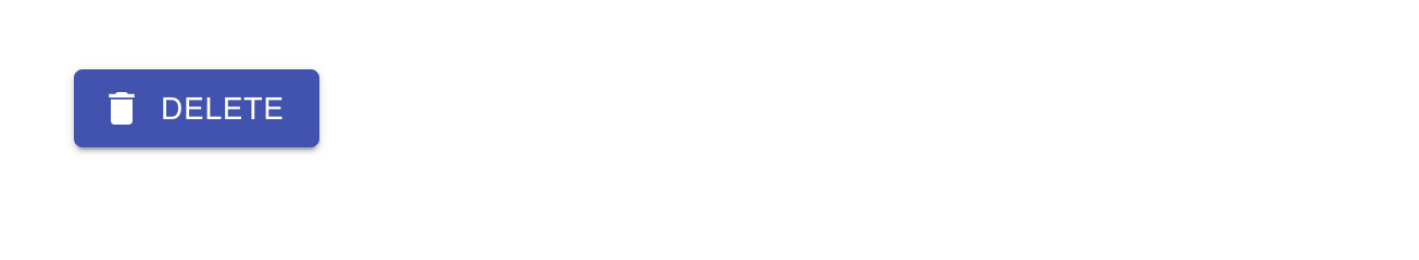
We can use the Button component to create a button with text and icon. We need to use startIcon property to add one icon to the start of the button. Let's take a look at the below example:
import { Button } from "@material-ui/core";
import DeleteIcon from "@material-ui/icons/Delete";

function App() {
  return (
    <div style={{ margin: 50 }}>
      <Button variant="contained" color="primary" startIcon={<DeleteIcon />}>
        Delete
      </Button>
    </div>
  );
}

export default App;
It will create the below button: