How to use Switch component in Material-UI react
Switch component in Material-UI react:
Switch component is used to show a material designed switch in Reactjs. In this post, we will learn how to use it with different examples.
Youtube video:
I have published one video on YouTube. You can watch it here:
Import switch component:
You can import this component as like below:
import { Switch } from '@material-ui/core';
Basic usage of switch:
We can import Switch component inside any other component to use it.
import { Switch } from '@material-ui/core';

function App() {
  return (
    <div style={{ marginTop: 100, marginLeft: 100 }}>
      <Switch />
    </div>
  );
}

export default App;
This will create one switch.

Changing the checked state:
We can use the checked props to change the checked/unchecked state of a switch. Also, we can use onChange props to listen for any click on the switch.
import { Switch } from '@material-ui/core';
import { useState } from 'react';

function App() {
  const [checked, setChecked] = useState(false);

  const switchHandler = (event) => {
    setChecked(event.target.checked);
  };

  return (
    <div style={{ marginTop: 100, marginLeft: 100 }}>
      <Switch checked={checked} onChange={switchHandler} />
    </div>
  );
}

export default App;
In this example, we are storing the checked/unchecked value in the checked variable, on click we are calling switchHandler to change the state.
Changing the color:
color props is used to change the color of a switch:
<Switch color="primary" checked={checked} onChange={switchHandler} />
We can also change it to 'default' color.
Disabling a switch:
disabled props is used to disable a switch:
<Switch disabled checked={checked} />
Changing the size:
We can change the size between normal and small using the size props.
<Switch size='small' checked={checked} onChange={switchHandler}/>
<Switch size='normal' checked={checked} onChange={switchHandler}/>
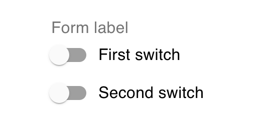
Adding switches in form:
We can put a switch in a FormControlLabel as its control and multiple FormControlLabel can be put inside a FormGroup.
<FormControl>
  <FormLabel>Form label</FormLabel>
  <FormGroup>
    <FormControlLabel
      control={<Switch checked={checked} onChange={switchHandler} />}
      label="First switch"
    />
    <FormControlLabel
      control={<Switch checked={checked} onChange={switchHandler} />}
      label="Second switch"
    />
  </FormGroup>
</FormControl>
It will create a *FormControl as like below:
By using labelPlacement props, we can change the position of the labels:
<FormControlLabel
  labelPlacement="end"
  control={<Switch checked={checked} onChange={switchHandler} />}
  label="Fourth switch"
/>
Custom switch:
We can also create one custom switch and change the color of its components individually:
const CustomSwitch = withStyles({
  switchBase: {
    color: green[600],
    '&$checked': {
      color: red[500],
    },
    '&$checked + $track': {
      backgroundColor: blue[500],
    },
  },
  checked: {},
  track: {},
})(Switch);
Complete program:
Below is the complete program that shows this full example:
import {
  FormControl,
  FormGroup,
  FormControlLabel,
  FormLabel,
  Switch,
  Box,
  withStyles,
} from '@material-ui/core';
import { blue, green, red } from '@material-ui/core/colors';
import { useState } from 'react';

function App() {
  const CustomSwitch = withStyles({
    switchBase: {
      color: green[600],
      '&$checked': {
        color: red[500],
      },
      '&$checked + $track': {
        backgroundColor: blue[500],
      },
    },
    checked: {},
    track: {},
  })(Switch);

  const [checked, setChecked] = useState(false);

  const switchHandler = (event) => {
    setChecked(event.target.checked);
  };

  return (
    <Box display="flex" flexDirection="column" m={10}>
      <Box mt={5}>
        <Switch checked={checked} onChange={switchHandler} />
      </Box>
      <Box mt={5}>
        <Switch color="primary" checked={checked} onChange={switchHandler} />
      </Box>
      <Box mt={5}>
        <Switch disabled checked={checked} />
      </Box>
      <Box mt={5}>
        <Switch size="small" checked={checked} onChange={switchHandler} />
      </Box>
      <Box mt={5}>
        <Switch size="normal" checked={checked} onChange={switchHandler} />
      </Box>
      <Box mt={5}>
        <FormControl>
          <FormLabel>Form label</FormLabel>
          <FormGroup>
            <FormControlLabel
              labelPlacement="top"
              control={<Switch checked={checked} onChange={switchHandler} />}
              label="First switch"
            />
            <FormControlLabel
              labelPlacement="bottom"
              control={<Switch checked={checked} onChange={switchHandler} />}
              label="Second switch"
            />
            <FormControlLabel
              labelPlacement="start"
              control={<Switch checked={checked} onChange={switchHandler} />}
              label="Third switch"
            />
            <FormControlLabel
              labelPlacement="end"
              control={<Switch checked={checked} onChange={switchHandler} />}
              label="Fourth switch"
            />
          </FormGroup>
        </FormControl>
      </Box>
      <CustomSwitch />
    </Box>
  );
}

export default App;