How to create Cards in Material-UI react
Material-UI Card component examples:
Material-UI Card component is used to show different contents with actionable items. For example, we can show text and images with action buttons. It provides different ways to create different types of cards easily. In this post, we will learn how to use the Material-UI Card component with examples.
YouTube video:
I have published one video on YouTube. You can watch it here:
How to import Card:
We can import Card component as like below:
import { Card } from "@material-ui/core";
Components of Card:
CardContent and CardActions:
Let's take a look at the below example:
import {
  Box,
  Card,
  CardContent,
  Typography,
  CardActions,
  Button,
} from "@material-ui/core";
import { Theme, createStyles, makeStyles } from "@material-ui/core/styles";

const useStyles = makeStyles((theme: Theme) =>
  createStyles({
    root: {
      display: "flex",
      flexWrap: "wrap",
      "& > *": {
        margin: theme.spacing(3),
      },
    },
  })
);

function App() {
  const classes = useStyles();
  return (
    <Box className={classes.root}>
      <Card>
        <CardContent>
          <Typography variant="h3">Card Title</Typography>
        </CardContent>
        <CardActions>
          <Button>share</Button>
        </CardActions>
      </Card>
    </Box>
  );
}

export default App;
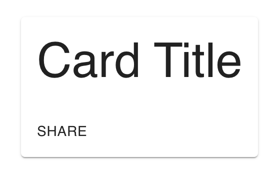
- CardContent component is used to put the contents.
- CardActions component is used to put the actions. We added one Button in this component.
It will create one card as like below:
We can also add more that one buttons in CardActions.
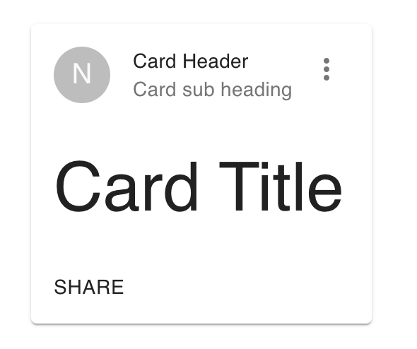
CardHeader:
CardHeader is used to add one header to a card. We can add one avatar, title, subheader and one action button. For example:
import {
  Box,
  Card,
  CardContent,
  Typography,
  CardActions,
  Button,
  Avatar,
  CardHeader,
  IconButton,
} from "@material-ui/core";
import { Theme, createStyles, makeStyles } from "@material-ui/core/styles";
import MoreVertIcon from "@material-ui/icons/MoreVert";

const useStyles = makeStyles((theme: Theme) =>
  createStyles({
    root: {
      display: "flex",
      flexWrap: "wrap",
      "& > *": {
        margin: theme.spacing(3),
      },
    },
  })
);

function App() {
  const classes = useStyles();
  return (
    <Box className={classes.root}>
      <Card>
        <CardHeader
          avatar={<Avatar>N</Avatar>}
          title="Card Header"
          subheader="Card sub heading"
          action={
            <IconButton>
              <MoreVertIcon />
            </IconButton>
          }
        />
        <CardContent>
          <Typography variant="h3">Card Title</Typography>
        </CardContent>
        <CardActions>
          <Button>share</Button>
        </CardActions>
      </Card>
    </Box>
  );
}

export default App;
It will one Avatar, title, subheader and one action to the card.
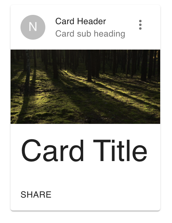
CardMedia:
We can show one image as a media using CardMedia component. e.g.:
<Box className={classes.root}>
  <Card>
    <CardHeader
      avatar={<Avatar>N</Avatar>}
      title="Card Header"
      subheader="Card sub heading"
      action={
        <IconButton>
          <MoreVertIcon />
        </IconButton>
      }
    />
    <CardMedia
      style={{ paddingTop: "50%" }}
      image="./media/background.png"
      title="Background image"
    />
    <CardContent>
      <Typography variant="h3">Card Title</Typography>
    </CardContent>
    <CardActions>
      <Button>share</Button>
    </CardActions>
  </Card>
</Box>
CardActionArea:
CardActionArea component is used to make one area of the card clickable. For example, we can put CardHeader, CardMedia and CardContent inside CardActionArea to make it clickable.
<Box className={classes.root}>
  <Card>
    <CardActionArea>
      <CardHeader
        avatar={<Avatar>N</Avatar>}
        title="Card Header"
        subheader="Card sub heading"
        action={
          <IconButton>
            <MoreVertIcon />
          </IconButton>
        }
      />
      <CardMedia
        style={{ paddingTop: "50%" }}
        image="./media/background.png"
        title="Background image"
      />
      <CardContent>
        <Typography variant="h3">Card Title</Typography>
      </CardContent>
    </CardActionArea>
    <CardActions>
      <Button>share</Button>
    </CardActions>
  </Card>
</Box>
Full example:
import {
  Box,
  Card,
  CardContent,
  Typography,
  CardActions,
  Button,
  Avatar,
  CardHeader,
  IconButton,
  CardMedia,
  CardActionArea,
} from "@material-ui/core";
import { Theme, createStyles, makeStyles } from "@material-ui/core/styles";
import MoreVertIcon from "@material-ui/icons/MoreVert";

const useStyles = makeStyles((theme: Theme) =>
  createStyles({
    root: {
      display: "flex",
      flexWrap: "wrap",
      "& > *": {
        margin: theme.spacing(3),
      },
    },
  })
);

function App() {
  const classes = useStyles();
  return (
    <Box className={classes.root}>
      <Card>
        <CardActionArea>
          <CardHeader
            avatar={<Avatar>N</Avatar>}
            title="Card Header"
            subheader="Card sub heading"
            action={
              <IconButton>
                <MoreVertIcon />
              </IconButton>
            }
          />
          <CardMedia
            style={{ paddingTop: "50%" }}
            image="./media/background.png"
            title="Background image"
          />
          <CardContent>
            <Typography variant="h3">Card Title</Typography>
          </CardContent>
        </CardActionArea>
        <CardActions>
          <Button>share</Button>
        </CardActions>
      </Card>
    </Box>
  );
}

export default App;