Reactjs Material-UI GridList component
Material UI Grid List:
Grid list component is used to display a grid of images. It provides a couple of easy way to show the list with different styling. For example, we can add a title bar, icon buttons, titles/description with each item etc.
YouTube Video:
Components used for Grid list:
We have the following components available to use with a Grid list:
- <GridList/>
- <GridListTile/>
- <GridListTileBar/>
- <IconButton/>
- <ListSubheader/>
Now, let's try to build a couple of different Grid lists:
data.json:
We will load the data from a local .json file. Create one file data.json with the below content:
[
  {
    "id": 1,
    "title": "Header First",
    "description": "Description First",
    "image": "https://cdn.pixabay.com/photo/2021/05/12/12/33/greater-celandine-6248215_1280.jpg",
    "cols": 2
  },
  {
    "id": 2,
    "title": "Header First",
    "description": "Description First",
    "image": "https://cdn.pixabay.com/photo/2021/05/12/12/33/greater-celandine-6248215_1280.jpg"
  },
  {
    "id": 3,
    "title": "Header First",
    "description": "Description First",
    "image": "https://cdn.pixabay.com/photo/2021/05/12/12/33/greater-celandine-6248215_1280.jpg",
    "cols": 3
  },
  {
    "id": 4,
    "title": "Header First",
    "description": "Description First",
    "image": "https://cdn.pixabay.com/photo/2021/05/12/12/33/greater-celandine-6248215_1280.jpg"
  },
  {
    "id": 5,
    "title": "Header First",
    "description": "Description First",
    "image": "https://cdn.pixabay.com/photo/2021/05/12/12/33/greater-celandine-6248215_1280.jpg",
    "cols": 2
  },
  {
    "id": 6,
    "title": "Header First",
    "description": "Description First",
    "image": "https://cdn.pixabay.com/photo/2021/05/12/12/33/greater-celandine-6248215_1280.jpg"
  },
  {
    "id": 7,
    "title": "Header First",
    "description": "Description First",
    "image": "https://cdn.pixabay.com/photo/2021/05/12/12/33/greater-celandine-6248215_1280.jpg"
  },
  {
    "id": 8,
    "title": "Header First",
    "description": "Description First",
    "image": "https://cdn.pixabay.com/photo/2021/05/12/12/33/greater-celandine-6248215_1280.jpg"
  },
  {
    "id": 9,
    "title": "Header First",
    "description": "Description First",
    "image": "https://cdn.pixabay.com/photo/2021/05/12/12/33/greater-celandine-6248215_1280.jpg"
  }
]
Example of basic GridList:
Update your App.js file as below:
import { GridList, GridListTile } from "@material-ui/core";
import "./App.css";
import dataList from "./data.json";

function App() {
  return (
    <div className="App">
      <GridList cellHeight={200} cols={3} style={{ width: 800, height: 600 }}>
        {dataList.map((data) => (
          <GridListTile key={data.id}>
            <img src={data.image} alt={data.title} />
          </GridListTile>
        ))}
      </GridList>
    </div>
  );
}

export default App;
- We are loading data from data.json file.
- cols defines the number of columns.
- We need to give cellHeight for each item in a GridList.
- For each item, we are adding the image inside GridListTile.
If you run it, it will produce one output as like below:
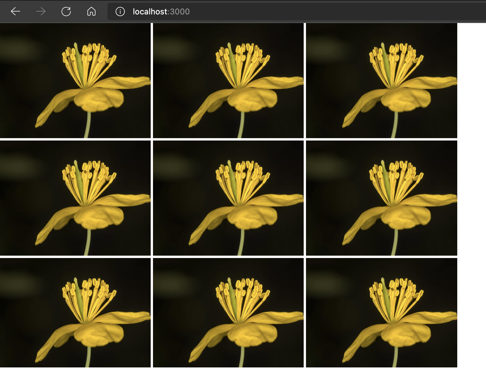
Variable size GridListTile:
We can have variable size GridListTile. In the JSON file, we have one property cols for some of these items. We can pass cols props in GridListTile to change the space it takes.
For example, if we change GridListTile as like below:
<GridListTile key={data.id} cols={data.cols || 1}>
    <img src={data.image} alt={data.title} />
</GridListTile>
It will assign different column sizes for different tiles. If cols is available, it will assign this value, else 1 for the tiles.
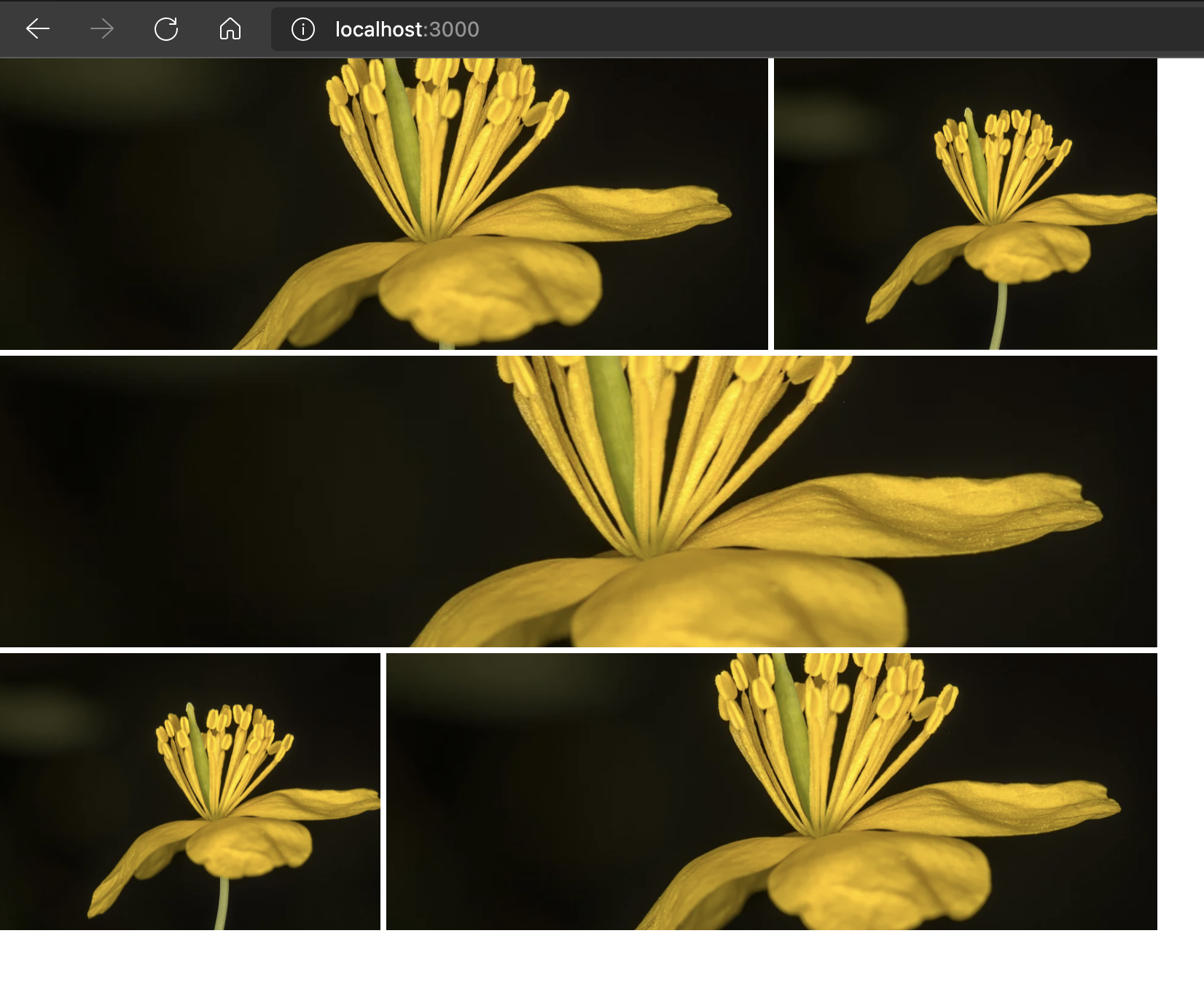
For the first item, it is 1, for the third item it is 3, for the fifth item it is 2. For others, it is 1.
Add GridListTileBar:
We can add one tile bar with each image in the Grid list. We can add one title, subtitle and one actionIcon as like below:
import {
  GridList,
  GridListTile,
  GridListTileBar,
  IconButton,
} from "@material-ui/core";
import "./App.css";
import InfoIcon from "@material-ui/icons/Info";
import dataList from "./data.json";

function App() {
  return (
    <div className="App">
      <GridList cellHeight={200} cols={3} style={{ width: 800, height: 600 }}>
        {dataList.map((data) => (
          <GridListTile key={data.id} cols={data.cols || 1}>
            <img src={data.image} alt={data.title} />
            <GridListTileBar
              title={data.title}
              subtitle={data.description}
              actionIcon={
                <IconButton>
                  <InfoIcon style={{color: 'white'}}/>
                </IconButton>
              }
            />
          </GridListTile>
        ))}
      </GridList>
    </div>
  );
}

export default App;
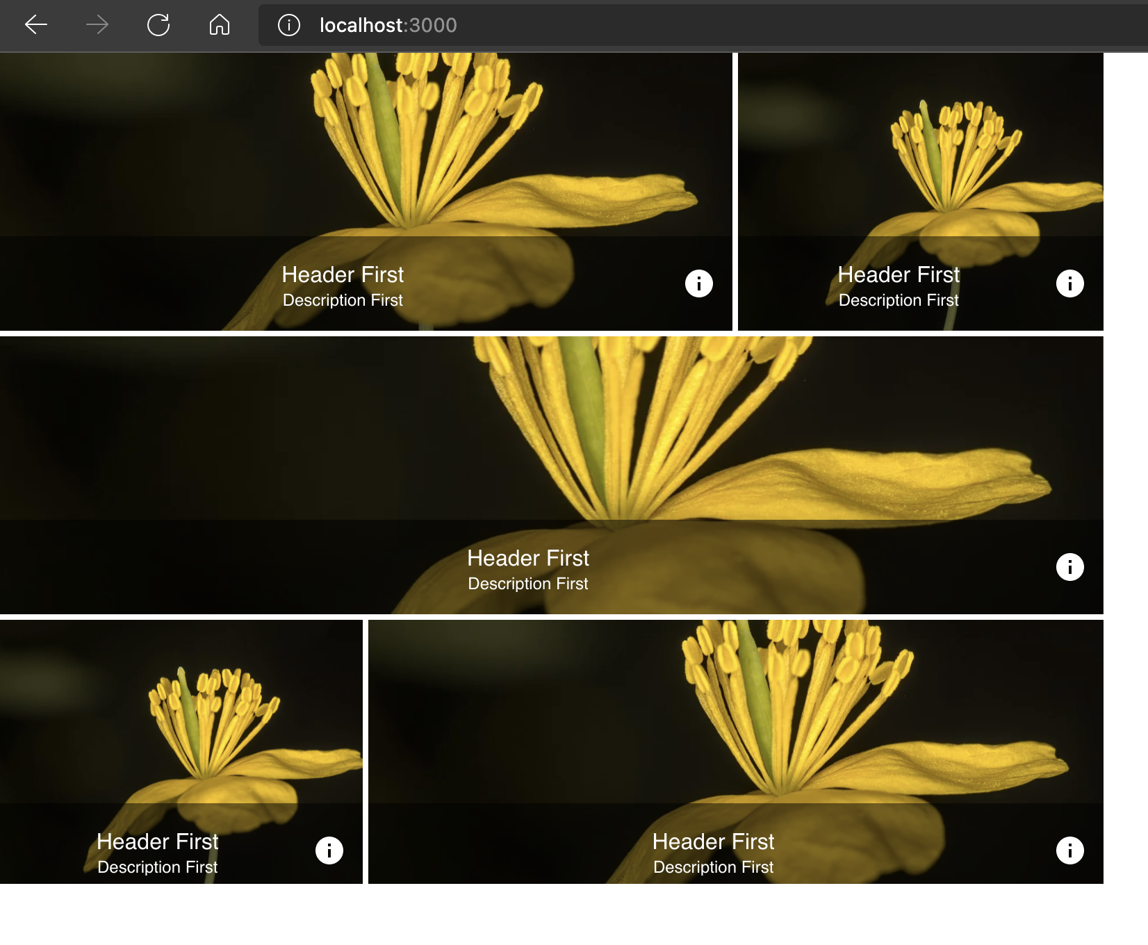
Change the title and description style:
We can change the title and description style of a GridListTileBar. For example, the below example will change the text to start of the tile:
<GridListTileBar
    title={data.title}
    subtitle={data.description}
    style={{textAlign: 'start'}}
    actionIcon={
    <IconButton>
        <InfoIcon style={{color: 'white'}}/>
    </IconButton>
    }
/>
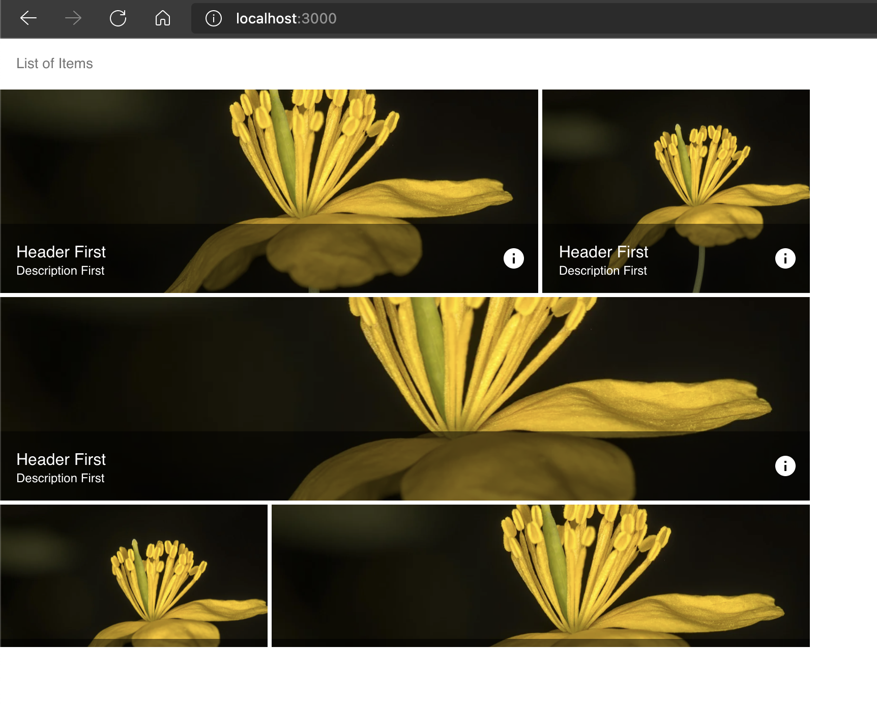
ListHeader:
We can add one header to the whole list. We need to add the header before loading the list:
import {
  GridList,
  GridListTile,
  GridListTileBar,
  IconButton,
  ListSubheader,
} from "@material-ui/core";
import "./App.css";
import InfoIcon from "@material-ui/icons/Info";
import dataList from "./data.json";

function App() {
  return (
    <div className="App">
      <GridList cellHeight={200} cols={3} style={{ width: 800, height: 600 }}>
        <GridListTile
          key="SubHeader"
          cols={3}
          style={{ height: 50, textAlign: "start" }}
        >
          <ListSubheader component="div">List of Items</ListSubheader>
        </GridListTile>
        {dataList.map((data) => (
          <GridListTile key={data.id} cols={data.cols || 1}>
            <img src={data.image} alt={data.title} />
            <GridListTileBar
              title={data.title}
              subtitle={data.description}
              style={{ textAlign: "start" }}
              actionIcon={
                <IconButton>
                  <InfoIcon style={{ color: "white" }} />
                </IconButton>
              }
            />
          </GridListTile>
        ))}
      </GridList>
    </div>
  );
}

export default App;
It will give: