How to create a Navigation drawer in Material-UI react
Material-UI Navigation drawer example:
In this post, we will learn how to create a drawer in Material-UI react. Material-UI provides a component called Drawer to create navigation drawers.
YouTube video:
I have published one video on YouTube, you can watch it here:
How to use Drawer component:
Drawer component is used to create a navigation drawer. It can be imported as like below:
import { Drawer } from "@material-ui/core";
Example of Drawer:
We need to pass one List inside the Drawer component. Let's take a look at the below program:
import {
  Drawer,
  ListItem,
  ListItemIcon,
  ListItemText,
  Button,
} from "@material-ui/core";
import {
  CheckBoxOutlineBlankOutlined,
  DraftsOutlined,
  HomeOutlined,
  InboxOutlined,
  MailOutline,
  ReceiptOutlined,
} from "@material-ui/icons";
import { useState } from "react";

const data = [
  {
    name: "Home",
    icon: <HomeOutlined />,
  },
  { name: "Inbox", icon: <InboxOutlined /> },
  { name: "Outbox", icon: <CheckBoxOutlineBlankOutlined /> },
  { name: "Sent mail", icon: <MailOutline /> },
  { name: "Draft", icon: <DraftsOutlined /> },
  { name: "Trash", icon: <ReceiptOutlined /> },
];

function App() {
  const [open, setOpen] = useState(false);

  const getList = () => (
    <div style={{ width: 250 }} onClick={() => setOpen(false)}>
      {data.map((item, index) => (
        <ListItem button key={index}>
          <ListItemIcon>{item.icon}</ListItemIcon>
          <ListItemText primary={item.name} />
        </ListItem>
      ))}
    </div>
  );
  return (
    <div>
      <Button onClick={() => setOpen(true)}>Click me</Button>
      <Drawer open={open} anchor={"left"} onClose={() => setOpen(false)}>
        {getList()}
      </Drawer>
    </div>
  );
}

export default App;
- open boolean variable defines if the drawer is open or close.
- getList method returns a list of items that we are showing on the drawer. On clicing any item it changes the value of open to false, i.e. it will hide the drawer.
- data array holds the title and icon to show in the drawer. We are using a map to create ListItem components.
- The anchor props defines where to show the drawer.
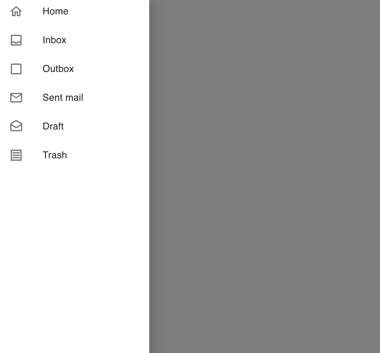
Permanent drawer:
By default, drawer is shown above the view or above the screen. We can also use the props variant as permanent to make it show always. persistant variant is used by default.
<Drawer
  variant="permanent"
  open={open}
  anchor={"left"}
  onClose={() => setOpen(false)}
>
  {getList()}
</Drawer>
It will create one drawer as like below:
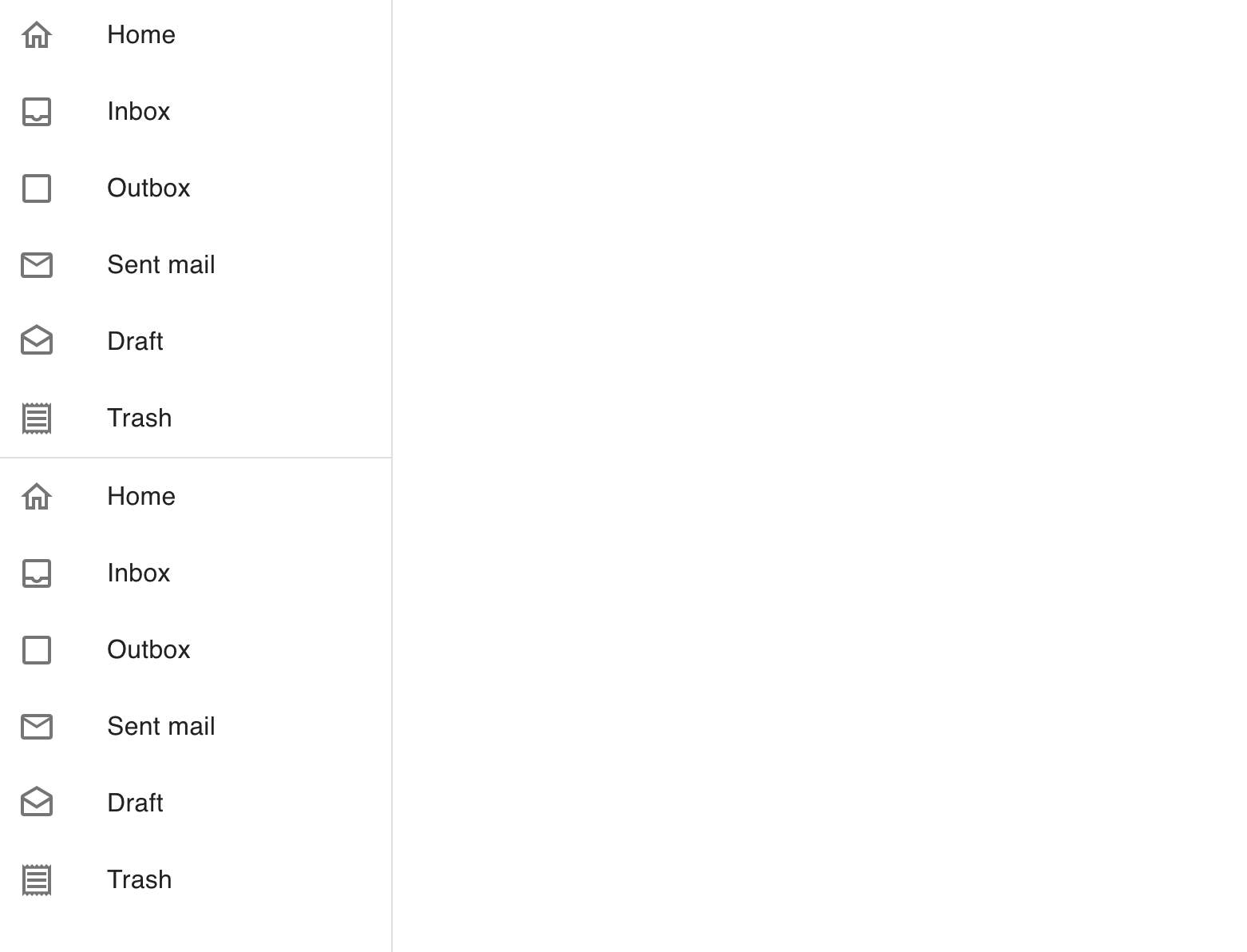
Adding a divider:
We can add a divider between drawer items. For that, we need to use the Divider component. For example:
<div>
  <Button onClick={() => setOpen(true)}>Click me</Button>
  <Drawer
    variant="permanent"
    open={open}
    anchor={"left"}
    onClose={() => setOpen(false)}
  >
    {getList()}
    <Divider />
    {getList()}
  </Drawer>
</div>
It will create the below drawer:
Complete program:
import {
  Drawer,
  ListItem,
  ListItemIcon,
  ListItemText,
  Button,
  Divider,
} from "@material-ui/core";
import {
  CheckBoxOutlineBlankOutlined,
  DraftsOutlined,
  HomeOutlined,
  InboxOutlined,
  MailOutline,
  ReceiptOutlined,
} from "@material-ui/icons";
import { useState } from "react";

const data = [
  {
    name: "Home",
    icon: <HomeOutlined />,
  },
  { name: "Inbox", icon: <InboxOutlined /> },
  { name: "Outbox", icon: <CheckBoxOutlineBlankOutlined /> },
  { name: "Sent mail", icon: <MailOutline /> },
  { name: "Draft", icon: <DraftsOutlined /> },
  { name: "Trash", icon: <ReceiptOutlined /> },
];

function App() {
  const [open, setOpen] = useState(false);

  const getList = () => (
    <div style={{ width: 250 }} onClick={() => setOpen(false)}>
      {data.map((item, index) => (
        <ListItem button key={index}>
          <ListItemIcon>{item.icon}</ListItemIcon>
          <ListItemText primary={item.name} />
        </ListItem>
      ))}
    </div>
  );
  return (
    <div>
      <Button onClick={() => setOpen(true)}>Click me</Button>
      <Drawer
        variant="permanent"
        open={open}
        anchor={"left"}
        onClose={() => setOpen(false)}
      >
        {getList()}
        <Divider />
        {getList()}
      </Drawer>
    </div>
  );
}

export default App;