How to create a Progressbar in Material-UI React
How to show a progressbar in Material-UI Reactjs:
Progress bar is shown to indicate a loading state. We have two different types of progress bars in Material-UI. One is circular progress bar and another is linear progress bar.
We will learn how to use these components with examples.
YouTube video:
I have published one video on YouTube that you can watch here:
Circular progress bar:
For circular progress bar, CircularProgress component is used:
import { CircularProgress, makeStyles, createStyles } from "@material-ui/core";

const useStyles = makeStyles((theme: Theme) =>
  createStyles({
    root: {
      margin: theme.spacing(30),
    },
  })
);

function App() {
  const classes = useStyles();

  return (
    <div className={classes.root}>
      <CircularProgress />
    </div>
  );
}

export default App;
It will create the below progress bar:

Changing the color:
We can change the color by using the color props:
<CircularProgress color="secondary" />
Determinate Circular progress:
We can change one CircularProgress to determinate by changing the variant prop to determinate. We need to provide one value to assign its progress.
<CircularProgress color="secondary" variant="determinate" value={20} />
value defines the percentage of progress completed.
We can use a state variable and assign its value to a determinate progress bar. For example, the below program increments the current level state variable by 10 after 700ms.
import { CircularProgress, makeStyles, createStyles } from "@material-ui/core";
import { useState, useEffect } from "react";

const useStyles = makeStyles((theme: Theme) =>
  createStyles({
    root: {
      margin: theme.spacing(30),
    },
  })
);

function App() {
  const classes = useStyles();
  const [level, setLevel] = useState(0);

  useEffect(() => {
    const timer = setInterval(() => {
      setLevel((newLevel) => (newLevel >= 100 ? 0 : newLevel + 10));
    }, 700);
    return () => {
      clearInterval(timer);
    };
  }, []);

  return (
    <div className={classes.root}>
      <CircularProgress color="secondary" variant="determinate" value={level} />
    </div>
  );
}

export default App;
Linear Progress bar:
For showing a linear progress bar, we can use LinearProgress component. It is similar to CircularProgress. For example:
import {
  CircularProgress,
  LinearProgress,
  makeStyles,
  createStyles,
} from "@material-ui/core";
import { useState, useEffect } from "react";

const useStyles = makeStyles((theme: Theme) =>
  createStyles({
    root: {
      display: "flex",
      height: "100vh",
      alignItems: "center",
      justifyContent: "center",
    },
    linearProgress: {
      width: theme.spacing(30),
    },
  })
);

function App() {
  const classes = useStyles();

  return (
    <div className={classes.root}>
      <LinearProgress className={classes.linearProgress} />
    </div>
  );
}

export default App;
This will give the below output:
Determinate linear:
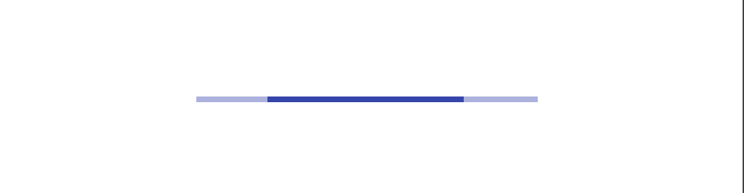
We can change one linear progress bar to determinal using the variant props. value is used to set the current value.
<LinearProgress variant="determinate" value={level} />
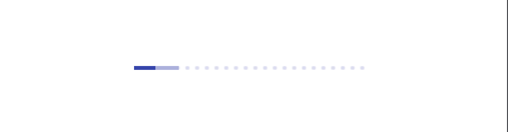
Buffer linear:
There is one more variant for linear progress bar called buffer. By using this variant, we can show one buffered progress along with the normal progress.
<LinearProgress variant="buffer" value={level} valueBuffer={level + 10} />
It will create one progress bar with a buffered progress:
Complete example:
import {
  CircularProgress,
  LinearProgress,
  makeStyles,
  createStyles,
} from "@material-ui/core";
import { useState, useEffect } from "react";

const useStyles = makeStyles((theme: Theme) =>
  createStyles({
    root: {
      display: "flex",
      flexDirection: "column",
      height: "100vh",
      alignItems: "center",
      justifyContent: "center",
    },
    margin: {
      margin: theme.spacing(3),
    },
    linearProgress: {
      width: theme.spacing(30),
    },
  })
);

function App() {
  const classes = useStyles();
  const [level, setLevel] = useState(0);

  useEffect(() => {
    const timer = setInterval(() => {
      setLevel((newLevel) => (newLevel >= 100 ? 0 : newLevel + 10));
    }, 700);
    return () => {
      clearInterval(timer);
    };
  }, []);

  return (
    <div className={classes.root}>
      <CircularProgress className={classes.margin} />
      <CircularProgress color="secondary" className={classes.margin} />
      <CircularProgress
        color="secondary"
        variant="determinate"
        value={level}
        className={classes.margin}
      />
      <LinearProgress className={[classes.linearProgress, classes.margin]} />
      <LinearProgress
        variant="determinate"
        value={level}
        className={[classes.linearProgress, classes.margin]}
      />
      <LinearProgress
        variant="buffer"
        value={level}
        valueBuffer={level + 10}
        className={[classes.linearProgress, classes.margin]}
      />
    </div>
  );
}

export default App;