How to use Reactjs Material-UI Slider component
Reactjs Material-UI Slider component:
Slider component is used to show a material designed slider in Reactjs Material-UI. This component is customizable and we can use its props to customize its look easily.
In this post, we will learn how to use Slider with example.
YouTube video:
I have published one video on YouTube. You can watch it here:
How to import Slider:
Slider is defined in material-ui/core and we can import it as like below:
import { Slider } from '@material-ui/core';
Once imported, we can use it in our components.
Basic example:
Let's take a look at the below example:
import { Box, Slider } from '@material-ui/core';

function App() {
  return (
    <Box display="flex" flexDirection="column" m={10}>
      <Slider />
    </Box>
  );
}

export default App;
It will create one simple slider that will take the width as the Box:

Set the slider current state in a variable:
We can keep the current slider value in a state variable and assign this value to the slider by using value props. Similarly, by using onChange props, we can listed for any change in the slider and update this value based on it.
import { Box, Slider } from '@material-ui/core';
import { useState } from 'react';

function App() {
  const [value, setValue] = useState(20);

  const changeValue = (event, value) => {
    setValue(value);
  };

  return (
    <Box display="flex" flexDirection="column" m={10}>
      <Slider value={value} onChange={changeValue} />
    </Box>
  );
}

export default App;
How to change the width of a slider:
We can change the width by providing a style to the slider:
<Slider style={{ width: 300 }} value={value} onChange={changeValue} />
Minimum, maximum value and step:
We can give one minimum, maximum value and step by using the min, max and step props respectively.
Similarly, we can use marks props to show these intervals:
<Slider
  style={{ width: 300 }}
  min={10}
  max={100}
  step={10}
  value={value}
  marks
  onChange={changeValue}
/>

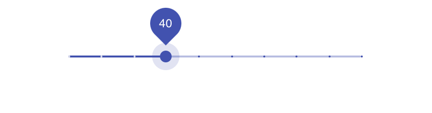
Show a tooltip:
We need to add two props for showing a tooltip. valueLabelDisplay and getAriaValueText. valueLabelDisplay handlers when to show the tooltip and getAriaValueText defines the text to show:
import { Box, Slider } from '@material-ui/core';
import { useState } from 'react';

function App() {
  const [value, setValue] = useState(20);

  const changeValue = (event, value) => {
    setValue(value);
  };

  const getText = (valu) => `${value}`;

  return (
    <Box display="flex" flexDirection="column" m={10}>
      <Slider
        style={{ width: 300 }}
        min={10}
        max={100}
        step={10}
        value={value}
        marks
        onChange={changeValue}
        valueLabelDisplay="auto"
        getAriaValueText={getText}
      />
    </Box>
  );
}

export default App;
if you assign valueLabelDisplay = 'on', it will always show the tooltip.
Disabling a slider:
disabled props is used to disable a slider:
<Slider disabled style={{ width: 300 }} value={value} onChange={changeValue} />
Custom marks value for different positions:
We can assign an array value to the marks props to show one label to the bottom of each step.
const customMarks = [
  {
    value: 10,
    label: '$10',
  },
  {
    value: 20,
    label: '$20',
  },
  {
    value: 30,
    label: '$30',
  },
  {
    value: 40,
    label: '$40',
  },
  {
    value: 50,
    label: '$50',
  },
  {
    value: 100,
    label: '$100',
  },
];
return (
  <Box display="flex" flexDirection="column" m={10}>
    <Slider
      style={{ width: 300 }}
      min={10}
      max={50}
      step={10}
      value={value}
      marks={customMarks}
      onChange={changeValue}
      valueLabelDisplay="auto"
      getAriaValueText={getText}
    />
  </Box>
);
If you assign step=, the tooltip will work only for the assigned marks.
Inverted slider:
Use track = 'inverted'.
<Slider
  style={{ width: 300 }}
  min={10}
  max={100}
  step={null}
  value={value}
  marks={customMarks}
  onChange={changeValue}
  valueLabelDisplay="auto"
  getAriaValueText={getText}
/>
Vertical slider:
Use orientation props to change a slider to vertical.
<Slider
  style={{ height: 300, marginTop: 30 }}
  min={10}
  max={100}
  step={null}
  value={value}
  marks={customMarks}
  onChange={changeValue}
  valueLabelDisplay="auto"
  getAriaValueText={getText}
  orientation="vertical"
/>
Multiple tooltips slider:
We can also configure a slider to have multiple tooltips. We need to provide an array of numbers to the value props. For example:
const [multiValue, setMultiValue] = useState([20, 30, 50]);

const changeMultiValue = (event, value) => {
  setMultiValue(value);
};

return (
  <Box display="flex" flexDirection="column" m={10}>
    <Slider
      style={{ width: 300, marginTop: 40 }}
      min={10}
      max={100}
      value={multiValue}
      onChange={changeMultiValue}
    />
  </Box>
);
It will add three tooltips.
All examples:
import { Box, Slider } from '@material-ui/core';
import { useState } from 'react';

function App() {
  const [value, setValue] = useState(20);

  const changeValue = (event, value) => {
    setValue(value);
  };

  const [multiValue, setMultiValue] = useState([20, 30, 50]);

  const changeMultiValue = (event, value) => {
    setMultiValue(value);
  };

  const getText = (valu) => `${value}`;

  const customMarks = [
    {
      value: 10,
      label: '$10',
    },
    {
      value: 20,
      label: '$20',
    },
    {
      value: 30,
      label: '$30',
    },
    {
      value: 40,
      label: '$40',
    },
    {
      value: 50,
      label: '$50',
    },
    {
      value: 100,
      label: '$100',
    },
  ];
  return (
    <Box display="flex" flexDirection="column" m={10}>
      <Slider style={{ width: 300 }} value={value} onChange={changeValue} />
      <Slider
        style={{ width: 300 }}
        min={10}
        max={100}
        step={10}
        value={value}
        marks
        onChange={changeValue}
        valueLabelDisplay="auto"
        getAriaValueText={getText}
      />
      <Slider disabled style={{ width: 300 }} value={value} onChange={changeValue} />
      <Slider
        style={{ width: 300 }}
        min={10}
        max={100}
        step={10}
        value={value}
        marks={customMarks}
        onChange={changeValue}
        valueLabelDisplay="auto"
        getAriaValueText={getText}
      />
      <Slider
        style={{ width: 300 }}
        min={10}
        max={100}
        step={10}
        value={value}
        marks={customMarks}
        onChange={changeValue}
        valueLabelDisplay="on"
        getAriaValueText={getText}
      />
      <Slider
        style={{ width: 300 }}
        min={10}
        max={100}
        step={null}
        value={value}
        marks={customMarks}
        onChange={changeValue}
        valueLabelDisplay="auto"
        getAriaValueText={getText}
      />
      <Slider
        style={{ width: 300 }}
        min={10}
        max={100}
        step={null}
        value={value}
        marks={customMarks}
        onChange={changeValue}
        valueLabelDisplay="auto"
        getAriaValueText={getText}
        track="inverted"
      />
      <Slider
        style={{ height: 300, marginTop: 30 }}
        min={10}
        max={100}
        step={null}
        value={value}
        marks={customMarks}
        onChange={changeValue}
        valueLabelDisplay="auto"
        getAriaValueText={getText}
        orientation="vertical"
      />
      <Slider
        style={{ width: 300, marginTop: 40 }}
        min={10}
        max={100}
        value={multiValue}
        onChange={changeMultiValue}
      />
    </Box>
  );
}

export default App;