Reactjs Material-UI ButtonGroup component
Button group component in Material-UI React:
For grouping multiple buttons, we can write our own component. But, Material-UI provides a different component called ButtonGroup to make it easy for us. We can use this component to group related buttons.
In this post, we will learn how to use ButtonGroup component with examples.
YouTube Video:
ButtonGroup component:
ButtonGroup component is used to group similar buttons. It can be imported as like below:
import ButtonGroup from '@material-ui/core/ButtonGroup';
// or
import { ButtonGroup } from '@material-ui/core';
Props of ButtonGroup:
Following are its supported props:
| Name | Description |
|---|---|
| children | Contents to show |
| classes | Override or extend the styling |
| component | String or HTML component to use as the root component. By default it is div |
| disableElevation | By default it is false. It will disable the elevation if we mark it as true |
| disabled | Use true to disable this group |
| disableFocusRipple | Enable/disable button keyboard focus ripple. true or false(default). |
| disableRipple | Enable/disable button ripple. false by default. |
| color | Color of the component. It can be default, inherit, primary or secondary. |
| orientation | Orientation of the button group. It can be vertical or horizontal(default). |
| size | It can be large, medium or small. By default, it is medium. |
| variant | It can be contained, outlined or text. By default, it is outlined |
Example usage:
Create one Reactjs project with Material-UI integrated. Update your App.js file as below:
import { ButtonGroup,Button } from "@material-ui/core";
import "./App.css";
function App() {
return (
<div className="App">
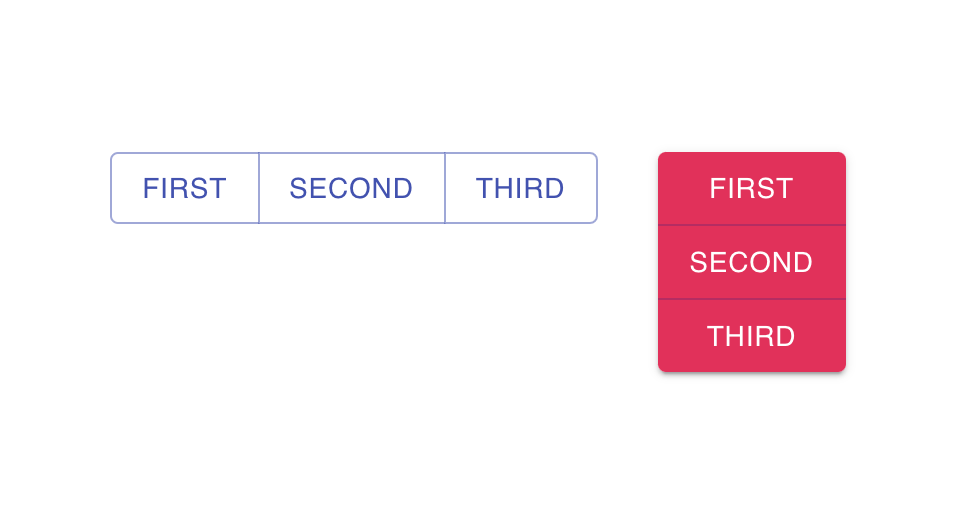
<ButtonGroup color='primary' variant='outlined'>
<Button>First</Button>
<Button>Second</Button>
<Button>Third</Button>
</ButtonGroup>
<ButtonGroup style={{marginLeft: '30px'}} color='secondary' variant='contained' orientation='vertical'>
<Button>First</Button>
<Button>Second</Button>
<Button>Third</Button>
</ButtonGroup>
</div>
);
}
export default App;
We are creating two ButtonGroup components here. Both have different colors, variant, and orientation.
It will given the below output: