Box - Material-UI Reactjs
Introduction to the Box component of material-UI Reactjs:
Box component is used as a wrapper component in Material-UI react. You can include any other components inside a Box component. By default, it creates a div component. We can also change it. That I will explain to you later in this post.
I have also published one video on the Box component. You can watch it on YouTube:
How to import it:
Box component is defined in material-ui/core . You can import it as like below:
import { Box } from "@material-ui/core";

and, you can use it in your App:

function App() {

  return (
    <div>
      <Box>

      </Box>
    </div>
  );
}
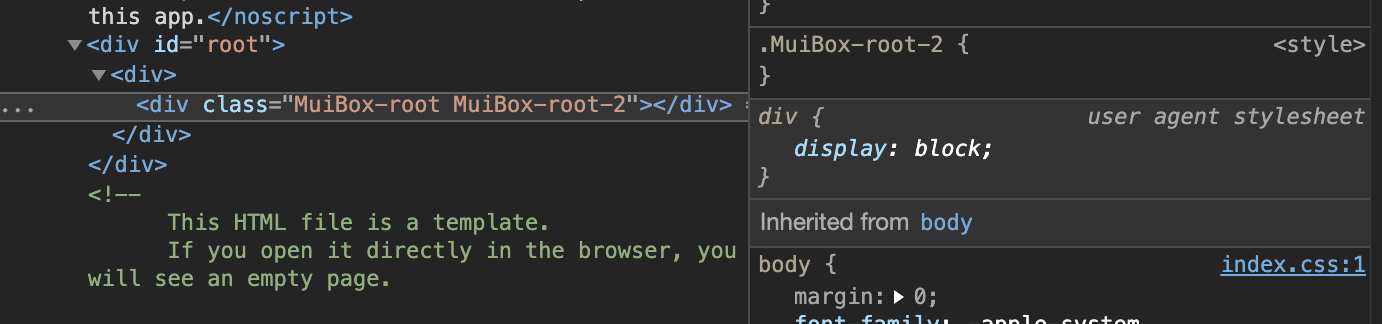
If you run the react-app, and inspect this component, it will be shown as a div component.
Change the color of a Box:
bgcolor is used to change the background color of a Box.
function App() {

  return (
    <div>
      <Box bgcolor='red' width={100} height={100}>

      </Box>
    </div>
  );
}
This will create one Box of background color red.
Change Box from div to another component:
We can change Box from div to any other component by using the component props:
function App() {
  return (
    <div>
      <Box component='span'>

      </Box>
    </div>
  );
}
This will change it to a span
Box with breakpoints:
We can configure Box with different breakpoints.
function App() {
  return (
    <div>
      <Box bgcolor={{ xs: "red", md: "blue" }} width={100} height={100}></Box>
    </div>
  );
}
If you change the browser width, its color will change.
Use any child components:
We can add any other components inside Box.
import { Box, Button } from "@material-ui/core";

function App() {
  return (
    <div>
      <Box bgcolor={{ xs: "red", md: "blue" }} width={100} height={100}>
        <Button>Click me</Button>
      </Box>
    </div>
  );
}

export default App;
It will add one Button in the Box.
clone property:
clone property is used to enable the usage of the clone element method. For example,
function App() {
  return (
    <div>
      <Box bgcolor='red' clone>
        <Button>Click me</Button>
      </Box>
    </div>
  );
}
This will change the color of the button directly.