How to create a Material design menu in Material-UI reactjs
How to create a Material design menu in Material-UI reactjs:
Material-UI provides one component called Menu, using which we can show a floating menu. In this post, we will learn how to use this component with examples.
YouTube video:
I have published one YouTube video on this component. You can watch it here:
Import Menu component:
We need two components to show a floating menu. Menu and MenuItem. Both are imported from @material-ui/core:
import { Menu, MenuItem } from '@material-ui/core';
Example of a simple menu:
Let's take a look at the below example:
import { Box, Menu, MenuItem } from "@material-ui/core";

function App() {
  return (
    <Box display="flex" flexDirection="column" m={10}>
      <Menu open={true}>
        <MenuItem>First</MenuItem>
        <MenuItem>Second</MenuItem>
        <MenuItem>Third</MenuItem>
      </Menu>
    </Box>
  );
}

export default App;
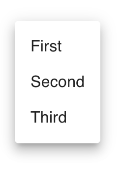
It will create one menu as like below:
Opening a menu on clicking a button and maintaining the state:
We can open the menu at the exact position of a button or any other view and also we can maintain the state. Let's take a look at the below program:
import { Box, Button, Menu, MenuItem } from "@material-ui/core";
import { useState } from "react";

function App() {
  const [anchor, setAnchor] = useState(null);
  const options = ["First", "Second", "Third", "Fourth"];

  const [selected, setSelected] = useState(-1);

  const openMenu = (event) => {
    setAnchor(event.currentTarget);
  };

  const closeMenu = () => {
    setAnchor(null);
  };

  const onMenuItemClick = (event, index) => {
    setAnchor(null);
    setSelected(index);
  };
  return (
    <Box m={50}>
      <Button
        onClick={openMenu}
        color="primary"
        variant="contained"
      >
        Click me
      </Button>

      <Menu
        open={Boolean(anchor)}
        anchorEl={anchor}
        onClose={closeMenu}
        keepMounted
      >
        {options.map((option, index) => (
          <MenuItem
            key={index}
            onClick={(event) => onMenuItemClick(event, index)}
            selected= {index === selected}
          >
            {option}
          </MenuItem>
        ))}
      </Menu>
    </Box>
  );
}

export default App;
Here,
- anchor is the anchor position or position where we want to show the menu. This value is set when we click on the button. It opens the menu at the button position.
- options are menu item values that we need to show. We are using map to show all menu items.
- selected is the index of the current selected menu item.
- openMenu and closeMenu methods are called when the menu will open and close. openMenu is called on clicking the button. closeMenu is called if we click on anywhere else on the screen. It will hide the menu.
- onMenuItemClick is called on clicking any menu item.
If you run this, it will show one button, on clicking that button it will show the menu:

Maximum height and width of a menu:
We can assign the maximum height and width of a menu. It will create the menu scrollable. For that, we need to give the style in PaperProps props:
<Menu
    open={Boolean(anchor)}
    anchorEl={anchor}
    onClose={closeMenu}
    keepMounted
    PaperProps={{
        style: {
        maxHeight: 40 * 4,
        width: "20ch",
        },
    }}
    >
Changing the animation of menu appearing:
We can change the appear/disappear animations of a menu by providing a props called TransitionComponent. We can use predefined transitions like Grow, Slide, Fade, Zoom as like below:
<Menu
    open={Boolean(anchor)}
    anchorEl={anchor}
    onClose={closeMenu}
    keepMounted
    TransitionComponent={Slide}
    ...
Transitions are defined in @material-ui/core.
Complete example:
import { Box, Button, Menu, MenuItem, Slide } from "@material-ui/core";
import { useState } from "react";

function App() {
  const [anchor, setAnchor] = useState(null);
  const options = ["First", "Second", "Third", "Fourth", "Fifth", "Sixth"];

  const [selected, setSelected] = useState(-1);

  const openMenu = (event) => {
    setAnchor(event.currentTarget);
  };

  const closeMenu = () => {
    setAnchor(null);
  };

  const onMenuItemClick = (event, index) => {
    setAnchor(null);
    setSelected(index);
  };
  return (
    <Box m={50}>
      <Button onClick={openMenu} color="primary" variant="contained">
        Click me
      </Button>

      <Menu
        open={Boolean(anchor)}
        anchorEl={anchor}
        onClose={closeMenu}
        keepMounted
        TransitionComponent={Slide}
        PaperProps={{
          style: {
            maxHeight: 40 * 4,
            width: "20ch",
          },
        }}
      >
        {options.map((option, index) => (
          <MenuItem
            key={index}
            onClick={(event) => onMenuItemClick(event, index)}
            selected={index === selected}
          >
            {option}
          </MenuItem>
        ))}
      </Menu>
    </Box>
  );
}

export default App;