Introduction to Backdrop component in Material-UI React
Backdrop component of Material-UI:
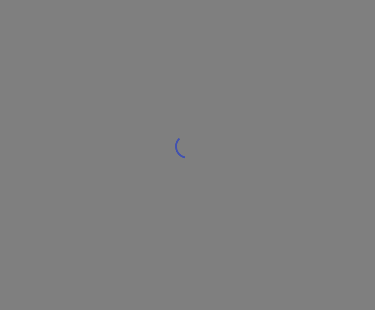
Backdrop is used to show a dimmed layout over the current window. We can use this to show a loader, dialog etc.
YouTube Video:
I have published on video on YouTube, you can watch it here:
Simple example on Backdrop:
Let's take a look at the below example:
import { Button, Backdrop, CircularProgress } from "@material-ui/core";
import { useState } from "react";

function App() {
  const [open, setOpen] = useState(false);

  return (
    <div>
      <Button onClick={() => setOpen(true)}>Click me</Button>
      <Backdrop open={open} onClick={() => setOpen(false)}>
        <CircularProgress />
      </Backdrop>
    </div>
  );
}

export default App;
If you run this app, it will show one Button. On clicking the button, it will show one Backdrop with a CircularProgress in it. If you click on the layout, it will hide that.