Grid - Material-UI Reactjs
Introduction to Material UI Grid:
In Reactjs Material UI, grid system is used to create responsive layouts that adapts to different screen sizes and different orientation.
In this post, we will learn how to use Grid layout with examples.
Video:
What is Grid system in Material-UI:
- Material-UI Grid is used to create responsive UIs.
- It uses 12 column Grid system.
- Grid component uses CSS's Box module.
- We can use two types of layouts : container and item.
- It also provides 5 different breakpoints: xs, sm, md, lg and xl.
- We can provide spacing. It can vary from 0 to 10. 1 is equal to 8px.
- We can provide direction as row, row-reverse, column, column-reverse
- justify can be flex-start, center, flex-end, space-between, space-around or space-evenly.
- alignItems can be flex-start, center, flex-end, stretch or baseline.
Example of Grid:
We need to use Grid component to use Grid. We have two types: container and item. We can have one container and inside a container, we can have many number of items.
Let's take a look at the below example:
import { Grid, Paper } from "@material-ui/core";

export default function App() {
  return (
    <div>
      <Grid container>
        <Grid item xs={6}>
          <Paper
            style={{
              backgroundColor: "red",
              color: "white",
              width: "100",
              height: "100"
            }}
          >
            Paper 1
          </Paper>
        </Grid>
      </Grid>
    </div>
  );
}
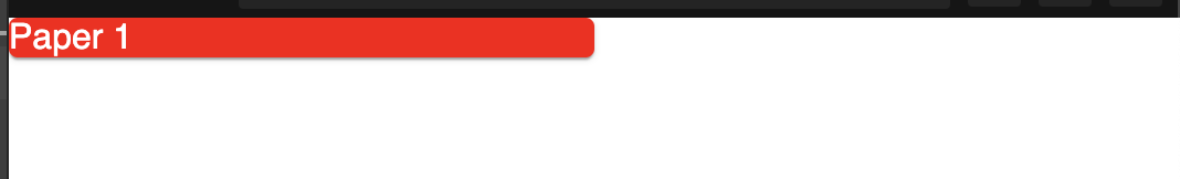
The Paper will take half of the screen. Because, we are giving 6 as the value for xs, i.e. it will always take half of the screen as it is a 12 column layout system. So, it will always take half of the screen for all screens xs and above.
Example with multiple Grid item:
Let's take a look at the below example:
import { Grid, Paper } from "@material-ui/core";
import "./styles.css";
const PaperComponent = (props) => (
  <Paper
    style={{
      backgroundColor: props.color,
      color: "white",
      width: "100",
      height: "100"
    }}
  >
    Paper 1
  </Paper>
);

export default function App() {
  return (
    <div className="App">
      <Grid container>
        <Grid item xs={6}>
          <PaperComponent color="red" />
        </Grid>
        <Grid item xs={6}>
          <PaperComponent color="blue" />
        </Grid>
        <Grid item xs={6}>
          <PaperComponent color="green" />
        </Grid>
      </Grid>
    </div>
  );
}
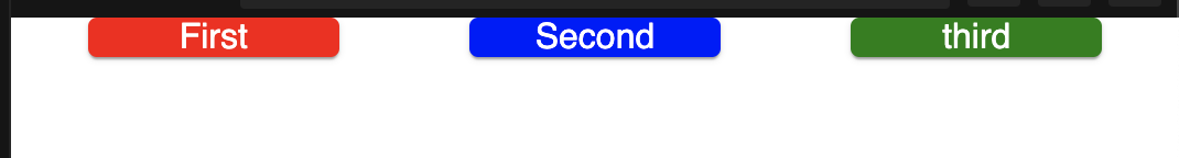
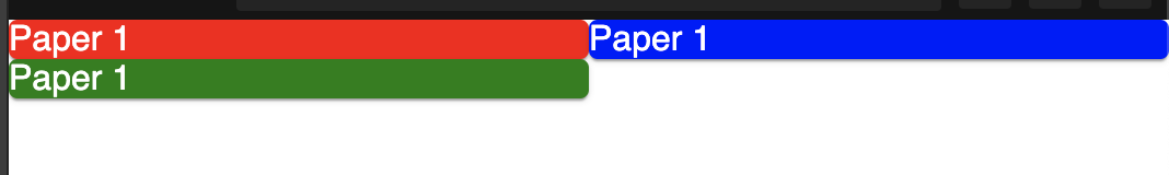
Here, we are showing three Grid items, each takes 6 column. Since we can have maximum 12 columns, it will push the third one to the next row.
Breakpoints:
We can provide different values for different breakpoints. e.g.
<Grid item xs={6} md={3} lg={12}/>
It will take 12 for all large and above screens, 3 for all medium and above screens(up to large) and 6 for all screens from extra-small to medium.
Following are the pixel values for each of these breakpoints:
xs, extra-small: 0px
sm, small: 600px
md, medium: 960px
lg, large: 1280px
xl, extra-large: 1920px
Spacing:
spacing can be from 0 to 10. 1 is equal to 8px. We need to provide it in the container:
<Grid container spacing={3}>
...
....
direction:
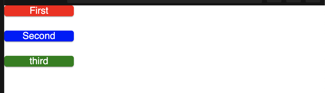
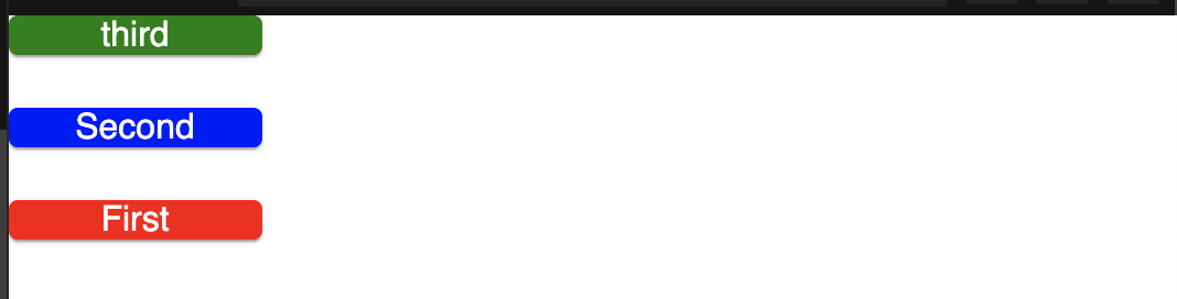
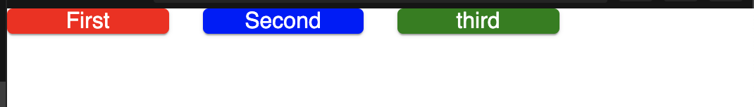
By default, it it row. We can assign from row, row-reverse, column, column-reverse. It needs to be added to the container.
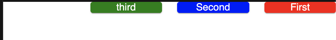
Grid container spacing=3 direction="row":
Grid container spacing=3 direction="row-reverse":
Grid container spacing=3 direction="column":
Grid container spacing=3 direction="column-reverse":
justify:
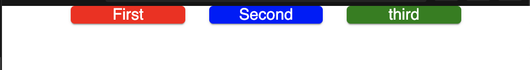
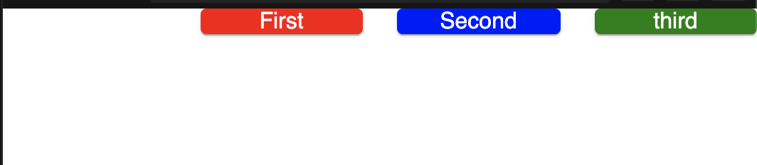
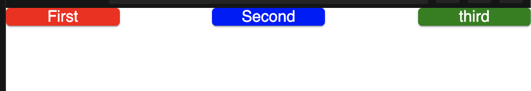
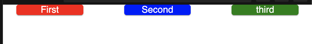
It is similar to flexbox. It can be : flex-start, center, flex-end, space-between, space-around or space-evenly.
container spacing=3 justify="flex-start":
container spacing=3 justify="center":
container spacing=3 justify="flex-end":
container spacing=3 justify="space-between":
container spacing=3 justify="space-around":
container spacing=3 justify="space-evenly":