How to create Badges in Material-UI React
How to use Material-UI Badge icon:
Material-UI Badge is used to show a badge with an icon. We can wrap one icon with the Badge component show a badge on that icon.
In this post, we will learn how to use badge with different use cases.
YouTube video:
I have published one video on YouTube. You can watch it here:
Simple example:
Let's take a look at the below example program:
import { Box, Badge } from "@material-ui/core";
import { Theme, createStyles, makeStyles } from "@material-ui/core/styles";
import { MailOutline } from "@material-ui/icons";
const useStyles = makeStyles((theme: Theme) =>
createStyles({
root: {
margin: theme.spacing(10),
},
})
);
function App() {
const classes = useStyles();
return (
<Box className={classes.root}>
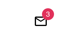
<Badge badgeContent={3}>
<MailOutline />
</Badge>
</Box>
);
}
export default App;
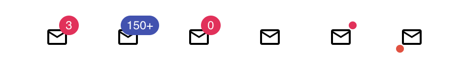
Here, we are wrapping the MailOutline icon with the Badge component. The badge count is shown by using the badgeContent props.
Changing the background color of the badge:
We can use color props to change the background color of the badge.
<Box className={classes.root}>
  <Badge badgeContent={3} color="secondary">
    <MailOutline />
  </Badge>
</Box>
Maximum count handling:
By default, it shows 99+ if the value is more than 99. But, we can also change it by changing the value of max props. For example:
<Badge max={150} badgeContent={300} color="secondary">
  <MailOutline />
</Badge>
It will show 150+ in the badge.
Showing 0:
If you put badgeContent as 0, it will not show that value. We need to add showZero props for that.
<Badge className={classes.badge} showZero badgeContent={0} color="secondary">
  <MailOutline />
</Badge>
It will show 0 as the badge.
Removing the badge:
You can add invisible = 'true' to hide the badge.
<Badge
  className={classes.badge}
  invisible={true}
  badgeContent={100}
  color="secondary"
>
  <MailOutline />
</Badge>
Show a dot in the badge:
We have another variant for the badge. It is called dot. You can use variant props to change it to dot.
<Badge
  className={classes.badge}
  variant="dot"
  badgeContent={100}
  color="secondary"
>
  <MailOutline />
</Badge>
How to change the badge position:
We can use the anchorOrigin props to change the position of a badge. We need to pass the vertical and horizontal values to change its position.
<Badge
  className={classes.badge}
  variant="dot"
  anchorOrigin={{ vertical: "bottom", horizontal: "left" }}
  badgeContent={100}
  color="error"
>
  <MailOutline />
</Badge>
All examples:
import { Box, Badge } from "@material-ui/core";
import { Theme, createStyles, makeStyles } from "@material-ui/core/styles";
import { MailOutline } from "@material-ui/icons";

const useStyles = makeStyles((theme: Theme) =>
  createStyles({
    root: {
      margin: theme.spacing(10),
    },
    badge: {
      margin: theme.spacing(3),
    },
  })
);

function App() {
  const classes = useStyles();

  return (
    <Box className={classes.root}>
      <Badge className={classes.badge} badgeContent={3} color="secondary">
        <MailOutline />
      </Badge>
      <Badge
        className={classes.badge}
        max={150}
        badgeContent={300}
        color="primary"
      >
        <MailOutline />
      </Badge>
      <Badge
        className={classes.badge}
        showZero
        badgeContent={0}
        color="secondary"
      >
        <MailOutline />
      </Badge>

      <Badge
        className={classes.badge}
        invisible={true}
        badgeContent={100}
        color="secondary"
      >
        <MailOutline />
      </Badge>
      <Badge
        className={classes.badge}
        variant="dot"
        badgeContent={100}
        color="secondary"
      >
        <MailOutline />
      </Badge>
      <Badge
        className={classes.badge}
        variant="dot"
        anchorOrigin={{ vertical: "bottom", horizontal: "left" }}
        badgeContent={100}
        color="error"
      >
        <MailOutline />
      </Badge>
    </Box>
  );
}

export default App;