How to use Reactjs Material-UI TextField component
Reactjs Material-UI TextField component:
Material-UI provides one text-field component to create one material designed textfield easily. This component is called TextField. In this post, we will learn how to use this component with examples.
YouTube Video:
I have also published one YouTube video on this component. You can watch it here:
If you love it, don't forget to subscribe :)
How to import it:
We can import this component as like below:
import { TextField } from '@material-ui/core';
That's it. Now you can use it in your component.
A simple example of TextField:
Let's take a look at the below example:
import { TextField } from '@material-ui/core';

function App() {
  return (
    <div style={{ marginTop: 100, marginLeft: 100 }}>
      <TextField />
    </div>
  );
}

export default App;
If you run this program, it will create one textfield as like below:

filled and outlined textfield:
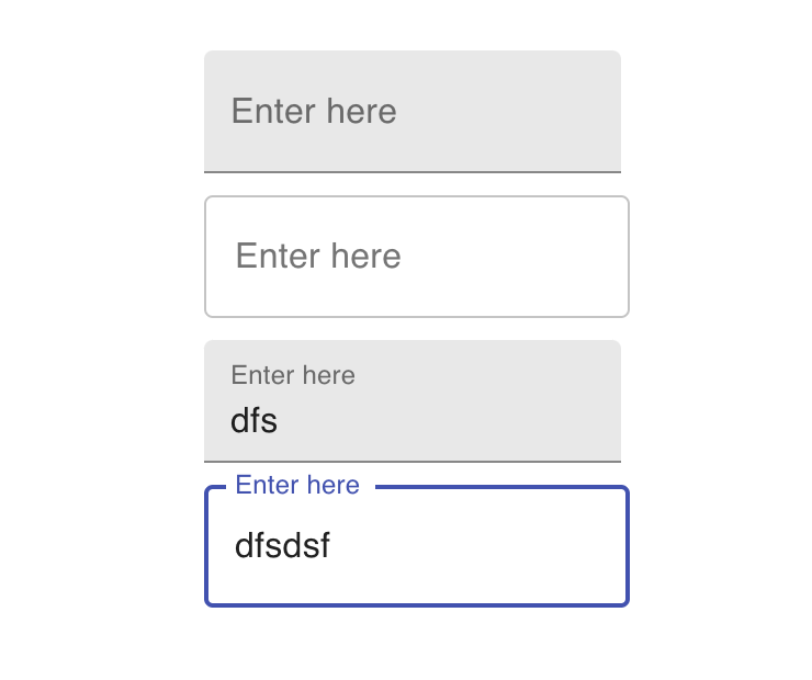
We can use the variant props to change it to a filled or outlined TextField. Similarly, we can use label props to give one label to a TextField. Let's take a look at the below example:
import { TextField } from '@material-ui/core';

function App() {
  return (
    <div style={{ marginTop: 100, marginLeft: 100 }}>
      <TextField variant="filled" label="Enter here" />
      <div style={{ margin: 10 }} />
      <TextField variant="outlined" label="Enter here" />
      <div style={{ margin: 10 }} />
      <TextField variant="filled" label="Enter here" />
      <div style={{ margin: 10 }} />
      <TextField variant="outlined" label="Enter here" />
    </div>
  );
}

export default App;
It has four different TextField components with different variants. It will look as like below for with and without any text entered:
Changing the size of a TextField:
We can use the size props to change the size of a TextField. It can be medium(which is default) or small.
import { TextField } from '@material-ui/core';

function App() {
  return (
    <div style={{ marginTop: 100, marginLeft: 100 }}>
      <TextField variant="outlined" label="Enter here" size="medium" />
      <div style={{ margin: 10 }} />
      <TextField variant="outlined" label="Enter here" size="small" />
    </div>
  );
}

export default App;
Changing margin:
margin is changed by the margin props. It can be normal or dense.
<TextField variant="outlined" label="margin=normal" margin="normal" />
Changing color:
color props is used to change the color. e.g.
<TextField variant="outlined" label="color=secondary" color="secondary" />
Required:
required props is used for this. It adds one * with the label:
<TextField variant="outlined" label="required" required />
Default value:
defaultValue props is used to give a default value to a TextField. It gives a default text to show in the TextField.
<TextField defaultValue="Default Text" variant="outlined" label="defaultValue=Default Text" />
disabled:
disabled props can be used to make one TextField disabled. We can't click on it if it is disabled:
<TextField variant="outlined" label="disabled" disabled />
Password inputs:
type='password' can be used to mark one TextField as password textfield.
<TextField variant="outlined" label="type=password" type="password" />
Readonly inputs:
For readonly, we need to set one flag in the InputProps props:
<TextField InputProps={{ readOnly: true }} variant="outlined" value="Readonly text" />
Number inputs:
We can also change the type props of a TextField as number to take only numbers as inputs.
<TextField type="number" variant="outlined" label="type=number" />
search:
type='search' changes it to a search field. It adds one cancel all button to the right:
<TextField type="search" variant="outlined" label="type=search" />
helper text:
Helper text is a text that is shown at the bottom of a TextField. We can use helperText props for that:
<TextField helperText="Helper Text" variant="outlined" label="helper text" />
error:
We can use error props to make one textfield error TextField.
<TextField error variant="outlined" label="error" />
Multiline TextField:
multiline props is used to create a multi-line text field. We can also give rowsMax props to define the number of rows.
<TextField multiline rowsMax={5} variant="outlined" label="multiline rowsMax={5}" />
Adding a icon:
We can add one icon to a TextField like below:
<TextField
  InputProps={{
    startAdornment: (
      <InputAdornment position="start">
        <AccessAlarm />
      </InputAdornment>
    ),
  }}
  variant="outlined"
  label="icon at start"
/>
It will add the icon at the start. You can use endAdornment to add that to the end.
We can also provide any text instead of an icon:
<TextField
  InputProps={{
    startAdornment: <InputAdornment position="start">$</InputAdornment>,
  }}
  variant="outlined"
  label="icon at start"
/>
Full code:
import { InputAdornment, TextField } from '@material-ui/core';
import { AccessAlarm } from '@material-ui/icons';

function App() {
  return (
    <div style={{ marginTop: 100, marginLeft: 100 }}>
      <TextField variant="outlined" label="size=medium" size="medium" />
      <div style={{ margin: 10 }} />
      <TextField variant="outlined" label="size=small" size="small" />
      <div style={{ margin: 10 }} />
      <TextField variant="outlined" label="margin=normal" margin="normal" />
      <div style={{ margin: 10 }} />
      <TextField variant="outlined" label="margin=dense" margin="dense" />
      <div style={{ margin: 10 }} />
      <TextField variant="outlined" label="color=secondary" color="secondary" />
      <div style={{ margin: 10 }} />
      <TextField variant="outlined" label="required" required />
      <div style={{ margin: 10 }} />
      <TextField defaultValue="Default Text" variant="outlined" label="defaultValue=Default Text" />
      <div style={{ margin: 10 }} />
      <TextField variant="outlined" label="disabled" disabled />
      <div style={{ margin: 10 }} />
      <TextField variant="outlined" label="type=password" type="password" />
      <div style={{ margin: 10 }} />
      <TextField InputProps={{ readOnly: true }} variant="outlined" value="Readonly text" />
      <div style={{ margin: 10 }} />
      <TextField type="number" variant="outlined" label="type=number" />
      <div style={{ margin: 10 }} />
      <TextField type="search" variant="outlined" label="type=search" />
      <div style={{ margin: 10 }} />
      <TextField helperText="Helper Text" variant="outlined" label="helper text" />
      <div style={{ margin: 10 }} />
      <TextField error variant="outlined" label="error" />
      <div style={{ margin: 10 }} />
      <TextField multiline rowsMax={5} variant="outlined" label="multiline rowsMax={5}" />
      <div style={{ margin: 10 }} />
      <TextField
        InputProps={{
          startAdornment: (
            <InputAdornment position="start">
              <AccessAlarm />
            </InputAdornment>
          ),
        }}
        variant="outlined"
        label="icon at start"
      />
      <div style={{ margin: 10 }} />
      <TextField
        InputProps={{
          endAdornment: (
            <InputAdornment position="start">
              <AccessAlarm />
            </InputAdornment>
          ),
        }}
        variant="outlined"
        label="icon at end"
      />
      <div style={{ margin: 10 }} />
      <TextField
        InputProps={{
          startAdornment: <InputAdornment position="start">$</InputAdornment>,
        }}
        variant="outlined"
        label="$ at start"
      />
    </div>
  );
}

export default App;