How to use Stepper component in Material-UI React
Material-UI Stepper component:
Stepper component provided by Material-UI is used to show step wise progress. In this post, we will learn how to use Stepper with examples.
YouTube video:
I have published one video on YouTube, you can watch it below:
How to import:
We need three components to create a stepper : Stepper, Step, and StepLabel. We can import it from material-ui/core:
import { Stepper, Step, StepLabel } from "@material-ui/core";
Simple example:
Let's take a look at the below example:
import { Stepper, Step, StepLabel } from "@material-ui/core";function App() {return (<div style={{ margin: 200 }}><Stepper><Step><StepLabel>Register your name</StepLabel></Step><Step><StepLabel>Register your email</StepLabel></Step><Step><StepLabel>Click on Finish</StepLabel></Step></Stepper></div>);}export default App;
It will create a simple stepper with three Step as like below:
activeStep:
Using activeStep, we can give one number value to Step, which will change the current active step.
<Stepper activeStep={1}>.........
completed:
Using completed, we can mark one Step as completed. For example:
<div style={{ margin: 200 }}><Stepper activeStep={0}><Step><StepLabel>Register your name</StepLabel></Step><Step><StepLabel>Register your email</StepLabel></Step><Step completed><StepLabel>Click on Finish</StepLabel></Step></Stepper></div>
optional:
optional can be added to a StepLabel component.
<Stepper activeStep={0}><Step><StepLabel>Register your name</StepLabel></Step><Step><StepLabel optional={<Typography variant="caption">Optional</Typography>}>Register your email</StepLabel></Step><Step completed><StepLabel>Click on Finish</StepLabel></Step></Stepper>
alternativeLabel:
Using this props, we can put the labels under the icons:
<Stepper alternativeLabel activeStep={0}><Step><StepLabel>Register your name</StepLabel></Step><Step><StepLabel>Register your email</StepLabel></Step><Step completed><StepLabel>Click on Finish</StepLabel></Step></Stepper>
disabled:
We can use disabled={true} to mark one step disabled.
<Stepper activeStep={0}><Step><StepLabel>Register your name</StepLabel></Step><Step><StepLabel>Register your email</StepLabel></Step><Step disabled={true}><StepLabel>Click on Finish</StepLabel></Step></Stepper>
nonLinear:
If we set one stepper as nonLinear, It will mark only the currently active step. For example:
<Stepper nonLinear activeStep={1}><Step><StepLabel>Register your name</StepLabel></Step><Step><StepLabel>Register your email</StepLabel></Step><Step><StepLabel>Click on Finish</StepLabel></Step></Stepper>
vertical stepper:
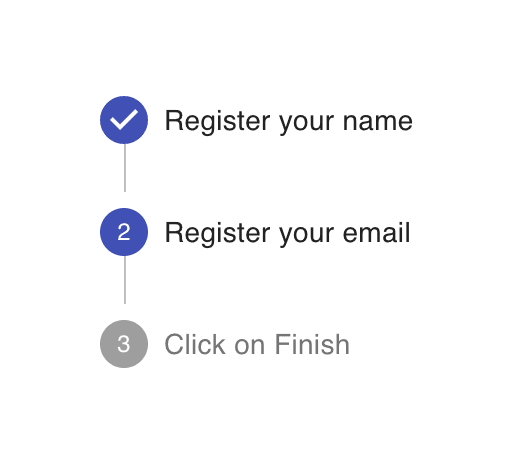
We can use orientation props to make one stepper vertical as like below:
<Stepper orientation="vertical" activeStep={1}><Step><StepButton>Register your name</StepButton></Step><Step><StepLabel>Register your email</StepLabel></Step><Step><StepLabel>Click on Finish</StepLabel></Step></Stepper>
It will create one vertical stepper :


