How to create a material dropdown selection in Reactjs using Material-UI
How to create a material dropdown selection in Reactjs using Material-UI:
Material-UI provides one component called Select to create a material dropdown selection in Reactjs. We can create one single selection dropdown or multiple selection dropdown using this component.
In this post, I will show you how to use Select component with examples.
Video:
I have published one video on YouTube. You can watch it here:
How to import Select:
We can import Select as like below:
import { Select } from '@material-ui/core';
Basic example:
Let's take a look at the below example:
import { Select, MenuItem } from '@material-ui/core';import React, { useState } from 'react';function App() {return (<Select value={2} style={{ marginTop: 100, marginLeft: 100 }}><MenuItem value={1}>Jan</MenuItem><MenuItem value={2}>Feb</MenuItem><MenuItem value={3}>March</MenuItem><MenuItem value={4}>April</MenuItem><MenuItem value={5}>May</MenuItem></Select>);}export default App;
If you run it, it will create one select component with default Feb as selected.

If you click on it, it will show the Menuitems with Feb as selected.

The value property defines which one to mark selected.
If you click on any of these items, it will not change the selection. For that, we need to maintain one state.
Using Select with FormControl and maintaining a state for selection:
We can also use Select with FormControl and we can maintain a state for the selected item in the list. Let's take a look at the below example:
import { Select, MenuItem, FormHelperText, FormControl, InputLabel } from '@material-ui/core';import React, { useState } from 'react';function App() {const [selected, setSelected] = useState('');const selectionChangeHandler = (event) => {setSelected(event.target.value);};return (<FormControl style={{ marginTop: 100, marginLeft: 100 }}><InputLabel>Months</InputLabel><Select value={selected} onChange={selectionChangeHandler}><MenuItem value={1}>Jan</MenuItem><MenuItem value={2}>Feb</MenuItem><MenuItem value={3}>March</MenuItem><MenuItem value={4}>April</MenuItem><MenuItem value={5}>May</MenuItem></Select><FormHelperText>Select a month</FormHelperText></FormControl>);}export default App;
We are reading the selected value from the selected variable. If you click on any item, it updates the selected value.
If you run it, it will give the below output:
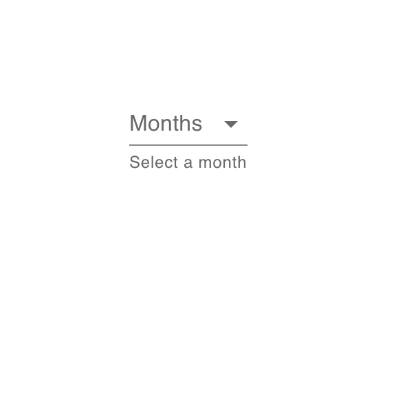
It is showing Months as no value is selected yet. If yo select any value, then it will change it to that value.
Showing a different value if not selected:
If you want to show a different value if nothing is selected, you can do it as like below:
<FormControl style={{ marginTop: 100, marginLeft: 100 }}><InputLabel shrink>Months</InputLabel><Select displayEmpty value={selected} onChange={selectionChangeHandler}><MenuItem value=""><em>None</em></MenuItem><MenuItem value={1}>Jan</MenuItem><MenuItem value={2}>Feb</MenuItem><MenuItem value={3}>March</MenuItem><MenuItem value={4}>April</MenuItem><MenuItem value={5}>May</MenuItem></Select><FormHelperText>Select a month</FormHelperText></FormControl>
If will be like below if nothing is selected:

Required, error and disabled:
We can change the FormControl as required, error and disabled using the below props:
<FormControl required ....<FormControl error....<FormControl disabled....
It will be as like below:

Outlined:
We can change it to outlined styled as like below:
<FormControl variant="outlined" style={{ marginTop: 100, marginLeft: 100 }}><InputLabel shrink>Months</InputLabel><Select label="Months" value={selected} onChange={selectionChangeHandler}><MenuItem value={1}>Jan</MenuItem><MenuItem value={2}>Feb</MenuItem><MenuItem value={3}>March</MenuItem><MenuItem value={4}>April</MenuItem><MenuItem value={5}>May</MenuItem></Select><FormHelperText>Select a month</FormHelperText></FormControl>
It will give:

filled:
Just change the outlined to filled to get the filled variant.

Multiple selection:
We can configure it to handle multiple selection from the menu items by using the multiple props in the Select component. We need to change the state to hold an array of items for that.
We can also use renderValue to show the selected items in any other component like in chip.
Let's take a look at the below program:
import { Select, MenuItem, FormHelperText, FormControl, InputLabel, Chip } from '@material-ui/core';import React, { useState } from 'react';function App() {const [selected, setSelected] = useState([]);const selectionChangeHandler = (event) => {setSelected(event.target.value);};return (<FormControl style={{ marginTop: 100, marginLeft: 100 }}><InputLabel>Months</InputLabel><Selectmultiplevalue={selected}onChange={selectionChangeHandler}renderValue={(selected) => (<div>{selected.map((value) => (<Chip key={value} label={value} />))}</div>)}><MenuItem value={'Jan'}>Jan</MenuItem><MenuItem value={'Feb'}>Feb</MenuItem><MenuItem value={'March'}>March</MenuItem><MenuItem value={'April'}>April</MenuItem><MenuItem value={'May'}>May</MenuItem></Select><FormHelperText>Select a month</FormHelperText></FormControl>);}export default App;
You can select multiple items from the list. Also, it is showing a Chip for each selected menu items.

That's it.